
Premium components
Progress bar
Getting started
Premium components
Beta features
Deprecated components
Managed Cloud
Premium feature
This is a premium feature which requires a paid plan to be used. See here for more details.
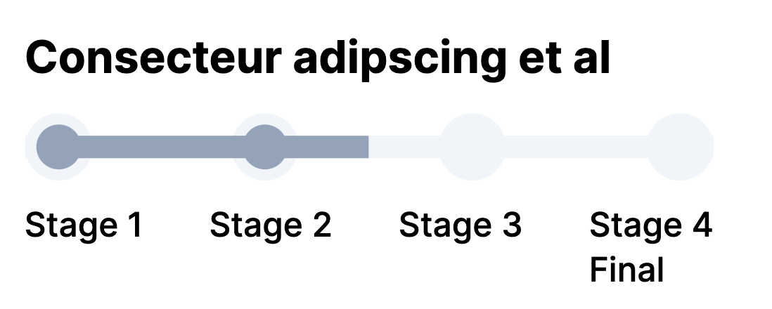
Progress bar
The progress bar component is used to display a progress through various named stages.
Example JSON
Below are two examples of the JSON required to define a Progress Bar component:
{
    "type": "ProgressBar",
    "options": {
        "progress": 50,
        "stages": [
            {
                "name": "Stage 1"
            },
            {
                "name": "Stage 2"
            },
            {
                "name": "Stage 3"
            }
        ]
    }
},
{
    "type": "ProgressBar",
    "options": {
        "width": "1/3",
        "title": "Consecteur adipsicing et al",
        "progress": 33,
        "stages": [
            {
                "name": "Stage 1"
            },
            {
                "name": "Stage 2"
            },
            {
                "name": "Stage 3<br> Final"
            }
        ]
    }
}
Options
| Key | Description |
|---|---|
stages | List of objects with key name containing the name of each stage. |
progress | Integer within range 0 to 100 specifying the progress. |
- Hybiscus will use the value of
progressto automatically figure out which stages have been completed and show them as filled in circles in the diagram. - The colour of the progress bar is controlled by the theme chosen.
Width
For details on the width key, please see here.
Example
Missing something?
Hybiscus is continuously improving and adding new features. If you think we are missing a critical feature, please do not hesitate to contact us and offer your feedback at support@hybiscus.dev