
Getting started
Premium components
Beta features
Deprecated components
Managed Cloud
Premium feature
This is a premium feature which requires a paid plan to be used. See here for more details.
Line Chart (v2)
The Chart.Line component is part of the premium set of chart components, with
greater control over their layout and design. The line chart allows visualising
data as individual lines grouped by a label, with or without dots.
Example JSON
Below is an example of the JSON required to define a Chart.Line component:
{
    "type": "Chart.Line",
    "options": {
        "width": "2/4",
        "data": [
            { "x": 0, "label": "A", "y": 5 },
            { "x": 1, "label": "A", "y": 7 },
            { "x": 2, "label": "A", "y": 3 },
            { "x": 3, "label": "A", "y": 12 },
            { "x": 4, "label": "A", "y": 9 },

            { "x": 3, "label": "B", "y": 5 },
            { "x": 4, "label": "B", "y": 7 },
            { "x": 5, "label": "B", "y": 3 },
            { "x": 6, "label": "B", "y": 12 },
            { "x": 7, "label": "B", "y": 9 }
        ],
        "color_scheme": "Tableau10",
        "font_size": 12,
        "aspect_ratio": 1.2,
        "x_label": "X axis label",
        "y_label": "Y axis label",
        "chart_title": "Chart title",
        "plot_dots": true,
        "caption": "Lorem ipsum dolor, sit amet consectetur adipisicing elit. Repudiandae provident ipsa culpa officiis illum commodi voluptas, sequi repellat veniam adipisci laboriosam amet nesciunt nam explicabo voluptate minima inventore, minus sint"
    }
}
Options
| Key | Description |
|---|---|
data | The data to plot in the chart. See below for more details. |
Data
The data key must be an array of objects, with each object containing the keys
x and y. Values can be grouped by providing a label key, which is used
to plot data points as separate lines. A maximum of 1,000 points can be plotted on a chart.
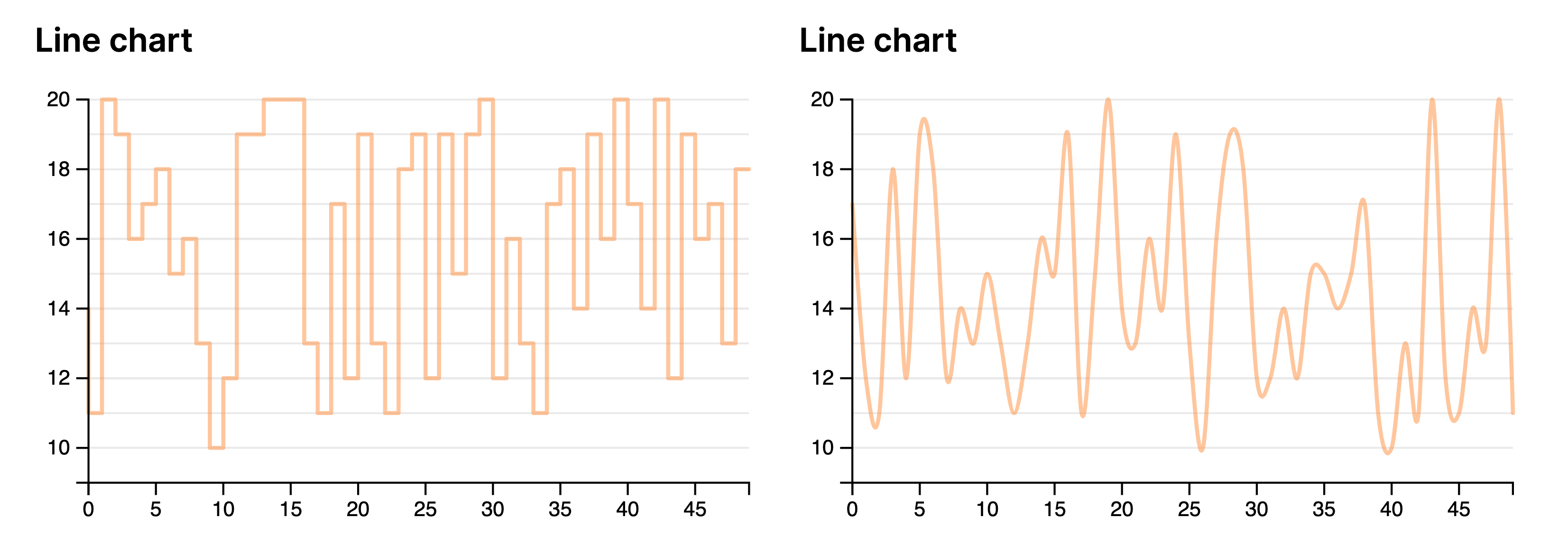
Curve format
The curve interpolation algorithm used to connect the dots between data points
can be customised. By default, it is set to MonotoneX. Any of the following
options are allowed:
- Linear
- Step
- Basis
- Step
- StepBefore
- StepAfter
- Natural
- Cardinal
- CatmullRom
- MonotoneX
The interpolation algorithms are based on the implementations in the D3.js data visualisation library, detailed here. Examples of the different algorithms are shown below:
Theming
The colour of the line is automatically chosen by the theme selected for the report. For more details see Theming. If the data
key contains data that can be grouped with multiple label values, the color_scheme key must be set to an option from color brewer scales. Allowed values include:
- Category10
- Accent
- Dark2
- Paired
- Pastel1
- Pastel2
- Set1
- Set2
- Set3
- Tableau10
Width
For details on the width key, please see here.
Example
Missing something?
Hybiscus is continuously improving and adding new features. If you think we are missing a critical feature, please do not hesitate to contact us and offer your feedback at support@hybiscus.dev