
Getting started
Premium components
Beta features
Deprecated components
Managed Cloud
Text
The Text component is used to add text to the report. The text can be formatted
with either HTML or Markdown.
Example JSON
Below is an example of the JSON required to define a Text component:
{
    "type": "Text",
    "options": {
        "text": "Lorem ipsum dolor sit amet",
        "bg_colour": "background-faded",
        "width": "2/3"
    }
}
Options
| Key | Description |
|---|---|
text | The text to add, either as Markdown or HTML |
width | Optional. The width of the component. Only applies when inside a Section or Row component whose columns option is set to null. |
horizontal_margin | Optional. Margin added horizontally to the element. Defaults to 0. |
vertical_margin | Optional. Margin added vertically to the element. Defaults to 1. |
align | Optional. Defaults to left. Text alignment, either left, right, center or centre. |
size | Optional. Defaults to sm. Font sizing options, see below for more details. |
colour \ color | Optional. Sets the text color using one of the named color theme variables. Refer to themes for more details. |
bg_colour \ bg_color | Optional. Sets the background color using one of the named color theme variables. Refer to themes for more details. |
inner_padding | Optional. Sets inner padding on the component. Defaults to 3 if bg_colour is set. Can take on any value from 0 to 17. |
markdown_format | Optional. Parses the text with a markdown formatter. Defaults to true. |
align_list | Optional. Whether to align every line of the list text. Defaults to true. Prior to this option being introduced, default value would be false. |
headings_margin | Optional. Margin added below headings, when using markdown formatting. Defaults to 2. |
Font size
For details on the size key, please see here.
Margin values
For the various options targetting margins, the allowed values are detailed here.
Width
For details on the width key, please see here.
Markdown support
The text added to the text key supports markdown (when markdown_format is set to true). This means you can
achieve the following:
- Bold text by placing text within double asterisks e.g.
**Text** - Italic text by placing text within underscores e.g.
_Text_ - New lines using the characters
\n\n - Heading styles 1-4 using
#symbols e.g.# Heading One,## Heading Two. - Hyperlinks using the syntax
[Text to hyperlink](https://www.google.com)
Lists support
You can also create lists inside a Text component using markdown in the following way:
{
    "type": "Text",
    "options": {
        "text": "Some content\n\n* List one\n* List two\n* List three\n\nMore content"
    }
}
Notice that the start and end of the list section is guarded by the \n\n
newline characters. However, between list items, the characters \n is used.
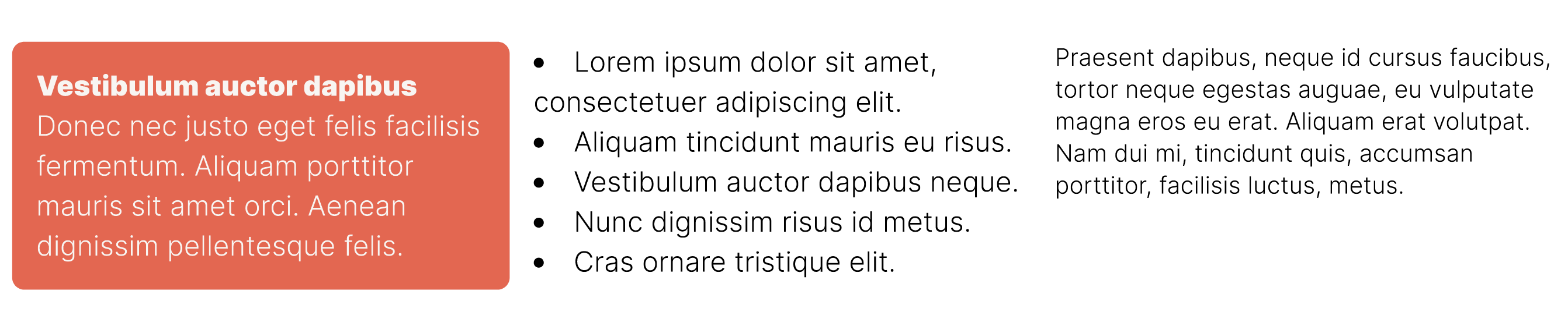
Example
Missing something?
Hybiscus is continuously improving and adding new features. If you think we are missing a critical feature, please do not hesitate to contact us and offer your feedback at support@hybiscus.dev