
Getting started
Premium components
Beta features
Deprecated components
Managed Cloud
Image
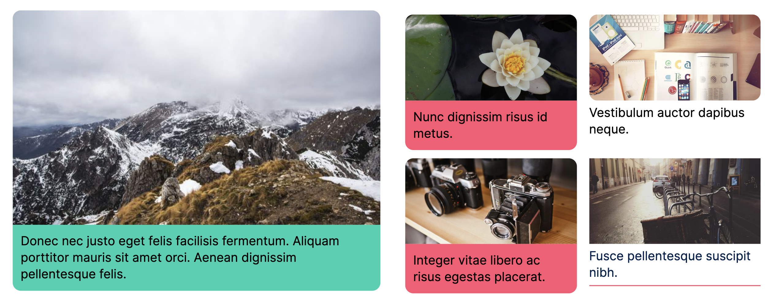
The image component is used to display images.
Example JSON
Below are two examples of the JSON required to define an Image.
{
    "type": "Image",
    "options": {
        "width": "1/4",
        "image_url": "https://picsum.photos/seed/picsum/600/300"
    }
},
{
    "type": "Image",
    "options": {
        "width": "1/4",
        "base64": "/9j/4AAQSkZJRgABAQEASABIAAD/4gIcSUNDX1BST0ZJTEUAAQEAAAIMbGNtcwIQAABtbnRyUkdCIFhZWiAH3AABABkAAwApADlhY3NwQVBQTAAAAAAAAAAAAAAAAAAAAAAAAAAAAAAAAAAA9tYAAQAAAADTLWxjbXMAAAAAAAAAAAAAAAAAAAAAAAAAAAAAAAAAAAAAAAAAAAAAAAAAAAAAAAAAAAAAAApkZXNjAAAA/AAAAF5jcHJ0AAABXAAAAAt3dHB0AAABaAAAABRia3B0AAABfAAAABRyWFlaAAABkAAAABRnWFlaAAABpAAAABRiWFlaAAABuAAAABRyVFJDAAABzAAAAEBnVFJDAAABzAAAAEBiVFJDAAABzAAAAEBkZXNjAAAAAAAAAANjMgAAAAAAAAAAAAAAAAAAAAAAAAAAAAAAAAAAAAAAAAAAAAAAAAAAAAAAAAAAAAAAAAAAAAAAAAAAAAAAAAAAAAAAAAAAAAAAAAAAAAAAAAAAAAB0ZXh0AAAAAElYAABYWVogAAAAAAAA9tYAAQAAAADTLVhZWiAAAAAAAAADFgAAAzMAAAKkWFlaIAAAAAAAAG+iAAA49QAAA5BYWVogAAAAAAAAYpkAALeFAAAY2lhZWiAAAAAAAAAkoAAAD4QAALbPY3VydgAAAAAAAAAaAAAAywHJA2MFkghrC/YQPxVRGzQh8SmQMhg7kkYFUXdd7WtwegWJsZp8rGm/fdPD6TD////bAIQAAgMDAwQDBAUFBAYGBgYGCAgHBwgIDQkKCQoJDRMMDgwMDgwTERQRDxEUER4YFRUYHiMdHB0jKiUlKjUyNUVFXAECAwMDBAMEBQUEBgYGBgYICAcHCAgNCQoJCgkNEwwODAwODBMRFBEPERQRHhgVFRgeIx0cHSMqJSUqNTI1RUVc/8IAEQgAyQEsAwEiAAIRAQMRAf/EADYAAAICAwEBAQAAAAAAAAAAAAUGAwQBAgcACAkBAAIDAQEBAAAAAAAAAAAAAAMEAQIFAAYH/9oADAMBAAIQAxAAAAD8c99vbGHj2M90O8uO7TGR/STzSu9GuIt+6XNYj3QZ6t1DO0/ln30+4BP8X6dz4ZoZukU8h16+Jde6HXMUTNrpt3a67+i0ft8RfO2mejONte7XG/ont/Jf04+b8Tc+UPb673nve19MY1l27tJIvtlN35w7H9FR+V9eg32D5oCd+sb9CEVRYlXQwmTg3U2YoPz4r/R3I/UeTUZqnnULmtT3Ta0336KWLMdSRei9F94dvd2k2m3RtmPTu+7hv0fzXwf0D5v5r9POejm/C4P7++fn8/gk/b/oFlRH7wS5t5v1CeUJdZSe5AR6HEg+vr75MSnPRb6J7hiz0Azenz3y7604nt4PLp+qbHX5zxL6pSGVeCbdf9oIci167P3cb36VUIFJ1ZKNbB97UXTW1mhmP09aF058t+s2bZoXNOQhl/nPpPNfXK98sdopd82VrC7A7r6kWQf2p6W1W76m4Vih4rnqmurk81b2CxnaaXz3pK40rz9xJSMKoQpsX3kFmmUK2qjoPZ6TAFVc6gGIBFsnbraafUdqUxzIV14z0/oDQqgPmP1FoXiqW0tznnr/AM/9d41HK9aDEr3DdMafLes8QGGFHKTYEvBObggs1iloQX3EzC488/MKD1cyu0n6TgGFqIdhCP5w8tXXyhqK8gfXxZblU8ddYmtsUTFHUsiPWPm66zffGJQa/J+tl5d1ZftVDYF8ywElWrkJrtTT29lWWdh4ravRTfzL0ITHdcKbZj62wF2u9HPrDYuTyoNcArK6qssyi6kDHFNXU1Ouy6aOQGY3S8u1yayZ1tTy5OqFFVqVDL+b5qqtKOh9PCYlzyHs4qFka4rpVs+oTaG7pPCuuI272Y4Jr+ltp8O5v34Jo5j7035gasPf+gaPNGDI2XO/z+aJJr89YwV0e0wzdTyyWCCCW2DeKhhMaw0pMulV1tPytaqaeX65Sli9wvRrjv8ASIjn9MRDRUIfzde5aG5R0GHy+bra7uLt0sRmEVZ42Hhsa+HQiO3sjdSp3SS1Uun0JNfyd7QdvU0BBWxcQ0l6Q1QialS4MaTUg75Q1cVPFui4YCx7oaq2ovTLZx1A1VWSk06SXS5fPepYaw3NGSdgLcrYpLoQAaMtTMhL4ffJUuLOla9azZsCx3k9EJ7mhTsAHks6zbkG2AfCBkKR0K4mMZraEDTk12MCoIbVt7PV9H8O2iiydGUu4AAelrQzCE6ldQ1Wy2vXFmWG8tm122giq21GWW8u3wnMX1+6Mxn2NglsSj8x0ptZFzzAPC12F/JxcQ2Hx8BBaj6ikxLuaXKpDKm/YYloyBhsLJ7dcBThTcLmVQ9WBNJLfiCVq46MRFl21yRsMQVcZCi4TRbY9hOgWWi0s3QlYLq/sEjldTLIDnJ1uzNmGmJrlAcDWgcxMvbUzVL2xctCEsQ0Z7DPhYOk+3ILGN6GOnaVCh2GYjdQpiyUDKSsCZQmjmJ14NYfQOXlm6MzJMAtLtMRBTshK44AYHLREvjOlym5/ciXvdHxNHCFfimGAOKzaWgkgmB3OSrxIRyF0PcEc1QDXSgcSIubO1KtMjU648ZdoMqQjsLruXYFVaj+ct1FoztYdkgFKDJftAwwWOiYAZCa6ItbmVpMvOmwtJrvK2+hW3AeRN01BX0i9zaljov3ARGpGKwukgMlog+bhaTKQSXZZ5RFZRxlwBxE3QOuxwDAE1fRyoqlPJ1v/8QAKxAAAgICAQMDBAIDAQEAAAAAAQIAAwQREgUTIRAUMQYiMkEVIyAzQjA0/9oACAEBAAEFAR6DfoVgPpyA9dwb/wAdzx67mx6ah9PHpubM2fTf/p8QgxTP16DkTWj2WfwVqSnovTwj9LxRd/EdI7Gd0ArDyB5iaBmhNTU8zRnH13/nqZv071DGjAqf8NT49cfoWbccX6f6bRZj/T/SLETHxagi4a5Qy8kvQzavoXGsSnG31jpZtdgVMDGctTYmpqEeu/XzNmb9a0/t6hg4mSCNH/HR30/6SpqR+y5rNbTqGfjY0ycyu5emGvKbIoQNfeMeW9Srzq0I9xn2BGyMCnIlnTMlZ5nn0EHp4mpoibm/Tx68hBTkU1PRTXMrpaNS3SupCZGHlY/qAZ0LoYSNm46y/OZbMP3JRcKzJtoxenY9+bhWhjbkNfaocjBqB9uWnO6p+p4ysLEua58LH3X0zBAyekY3YdGUzZm549ANzsPPbNPbztLO2s7aQXp2885gX22Y0oLyy1mGR9PVmY30rm3P0v6fwMLJbKtpLqL3xOnhiKxxapTOysGPWoGPXxaypY7Y5auyszRWOt3cyntW9MOlCMYMgw9TM6UbCOhro9DUQdMxkDYWNo4dCFhpT8EgT9nc8TxEC2q3TMp4OkFns6Nh1i/J6LUFy+hs6NWK8lhbclKst12BRV2M5spgiDQUC+3dqu5zQ8yMDIe1MW9aMXFvVA7iW3DtXdQ7I9wztVS7JbjXWt27A9l1tdjZlgNg3HW9JWzFLj9wQAnEDj2dQl2NQS9Cidt4KLhTi5XUOHfuKPi23Utg5Fb25DOemdbyKhRndymqvGyGHRMfvVKKa27joHBitYz2OS600vdlY4YqOAH3Hhdq3Eci3Borq4KFbesnLVYSz2NVc7+2hofftbFPaVYewT3NQXWtGStiU8e1WDHTSkEWsA29I3f1kvkA9YuqutweNq9Oy8jGyKrKLhtydAQMygci1G+JTcFGycTHM/pSbZhdnbJDA0hy9qFT3TxNb7dPtSlyzCsCzKCw2MWtcvKh2iqpyJLMi8FCtvb8tGGxa1que2OXYZeRXRX/ACtKVscOyvAGDYf4XEF+NU1dLBloppUVMK5SVULYTFYmfuzj22UKxsxVpeujimkdcqoK9gJJ8mwiDSxnXVj849takG03NUdCvaNXuVVqsybORxlDmziIlp0rV3KpCo1bGZfTb7ZV03CVPadPC0iis8OZ4qkuFbykX9q+mysUswFYEFw17gR79sXcntvGrTixVa66xOBUtySWXuS7lAi5Fpe1BPaXFv4i9A2NYrJ3GNqDbfaWcK5vtBFjxchwuKlaqqPs9vT2DtHZZLwqWvTVnpfSpy+qUcsf3NhclVbMydtk5ndwLqcqdpWmPhqYtOoAoL2+WAnb8OeA3RyuO2OiUxg9mXXExCjLyRsvOdlGOdf1Ug2NZL3buOvOztyuvbbVYb8fe2Estc2C5i7ziYD4trssNOFyzabq1Zb1ta4U29Mzj/YX6kbsTLbtC53mnRe+/FrGSWFiCz8bn8mrcNW52YFYxaAi1o/Jllh4li/J2jZDa4KRoCJb4FrbDswsuNcUsJZ5HJAOX2hxNDR+EcEd+pcjqJpux7nLNn9OuyaKOkZWHK8cU2tZ2ZXaxve23VaNYg5KOab7qcm47J8tqIVE2pjeBfmqI99hd7UaPrTAzuETzAu5XxDsbt286sf+UsCDOyFuBUwNB8D45GMxK8TpdJFGgoDvbdeSEPHi7R8bytt6B3oefyV8LroBjFpSFDoqBBC/EWM3BccPLcaIiKXXbBOc7OgTqC7k3MCwcZkZYRcYPeHxlXKXW98TvkRYZ3vs5Ditz8UPE2W2onTDkd97ld1G4EXQXwrMI1FVgsru1SlSQJxnEk6MbULqC1lcdxtn8/t6gJwAi4x4DRdv7Gqx6WsLOYCQOFQmJ26i83CfCARlYNs6G4vIqy+PiU43FRjtBXufbslDNhC1lBmZm2mlU7tCPZXYtlby/MpraxzOSmWiD4J8lgZxBltb8cq1nZjuLXO3CF3ZV9/Oc5yE2NhvCEaDlgE1NJFcAAnjWiwNXx57A4QHZUS3IRclrKlh2xx1rqxw691lVhZyfKKW8X0CLBysIabM4NHpsC8LC4pZG7Ql1uL2FQQchDVYCtvjm03uLoTcEXSzYgKwfHHxxHELsaEB0OarFJ5eXHtsdrLhbod1gzNO85iW1lKbvtvvGPkloEp0rAMv4VMiVUUo1edWtaOHZuJ0mI1lVmxPe277vgP5FkDQN5Bgec4PgMJ3IpBnOB1m/P2xyjoSRO6AxJEsLrD+TJ40Q3L7epU15PSenrvG1ucSSq+FXZx8m6pbGtZ2UglXMay5TVkNUbLO5Z8xTK4C0RmimLNmB/DWLOYisYIWHE7E5qAjKSz7ssPlbe1Y3F5w2w+0FVIWuI6pdZXbh5FLVuvJ9eZ/dxs5ANazFmAjlTGUEMsZWBUQaikTawTkYljIeUQznuDRIdtA6hv0ee53QZ3FsII5e5XlbdirKrcW5e5ZKw5ndnIywFpTu+nEt7di+D8hm0Hs5E/PPULJosI9g2XOx4gMDLO4IL/t3FM5T9AEzkYbmnOCyC2Fm23HSZVglmSYLSTXkaDAkJayw8miGAxbCLEtSxq7CgML8Sdz9GHkAzGEgEts7aacTmDFOz905GfcYnHfIbteriL0Ae9ie40Fs7s72p3yoW9iSzBzZ93Lz3UCB02Ll13SYvOPaNqgFZcCpSq1tYsZ5YQYXTb2oAbfL2bJMF67a/ZBczRM4kRLXneIVsniFvLM7PurIcMLnaPlorC9GBYiB53JynNoX2eU3qBxFIEUjj3WtPIACwIfESxZ3I1kZjHY7Z9QW8o1onKD8h+Z9B+S/mY0T4b8J/wJR/qX5/7EX4g+R+TT91f7X/8AiX4/afP/ADV+X7/bxvi30WGf/8QAOhAAAQMCBAQEBAQFAwUAAAAAAQACESExAxJBURAiYXETMoGRBCCh0TNCseEjQ1JiwRQwQDRQcoKS/9oACAEBAAY/Af8AuYYxuZxsAh4+KGViBX6pnITeXEpgb8Mx7De4Iog5vw4LwKj7ZkXYDpNeTVEEQRcf8NvlxJE8p2UEQdv9lmZnhB8QX9eiAx3ue4zQilOixHf6dhymkUogxhbhSDFAJCxcLxHHErykfVOY/CFqQVGYufIyREfROzOe7NoKtHYLOMoi9bo4rHgu/UIhwIPy3/3cTxspm2Xyn6VWLiYbchY5zXNJAIy0p0RG1PmECZKwcT4gk4ty38oOgUPh0GkzKYcUWNBEg+qbDGNcdRoE5hyljtxBCALMTM3yvcZPug0VdEqmaW/0tmuywppbMZo5YLIJwziAiDsU/IBiNbdpoR2KJBgaExRcpZiD+0/f/gu/G8OfMCBU6rmdYnuPRN8HBLsQwXOmB2Er/pcT0E/om+Ngvw81swieIWF8Q/CeXhuYhwhrP3TWPpQy6elLp+CwOMmjmadaoF4c93s2lk9+O2p5Q3p3WbFwxAXiYGOHN1bYe6A8Mse0GpqmudhluIPzNKc6buk0RyxQXO10S9ueDXlkFYfgNOWczgdE+Hyc9a/lOqd4hLp8rm0O9UfEdidKgUU4c5op17yuZsfNRW4X+QsyDpWYH3RhrXNmfLZBxwqEz0osrjIUQfDcDLXCbqcDFI6OqiPFwxF7lDPGK/8AqdSOgChuQtbQZtEc7MV4eJoJEov8OMrjlmhACFfUK4hQYPotANUCIqvxWwaiqB8WCRe/usjozaHQ9kKoQJBO0wgcX4dhnlllHBSOalnVUYhz7dFBxC5sUlS02Q/iu9l+I/2CqSe6P8NSGk96oiAO3z0xYjSqB8Zu9vuub4to0hS/4pjd5T8uM/FinKMqA/jNOgdEe4QA8s0AFO6zQ+RYC2ZFr4ANtSUGzVz/AMMUNBeNgsN4c7I9strtugIk6lUr2Tf4Wu9UIPu26B8U5ulI9FOJig5283LGbqm4Ra3EAOpggdE9uK1rW5qQi0kvyofxOkqcX0ICL8PnzaafspIy7SKypLDA2MIgOcAI/ulGcMxuoOaDroq8ya7DaQh4rR6UXIyndeXMeitlVXOPZeUrlfPQryo4uG5zTm5WxosuIxlLGB9ZVL9h/hYhxcUDODfTusRuDleyQQSaGNQsfBfhhuI1xfRu3RHDNWmobFCOnVN5SWOtlbRSTUW5iIQcBTWuaVUyWiBStE0g6SptRNO1keZAP8sJrPE8jaHXsi11wYIKMeioKoAAB2bmnbooyh0k3qi0eUainYITX6Kku/tAunEhra1yj6Kjg1vuVEx/lXU0HdcxoUYYXlUdl6QubKe11OaEQbrQ91+GEJoNURuFDeQmsqPGPSsQhh+I6zsodEGPusLGewDMJEfm6SsDDyZiwO1Mg9Fh4gx2OGTnw9HdO68TD5C4TsuYNbS+hV03nKuiKSV5vVechVxXnoKK0G3Mcyhg11ssrHT1Gnum5sUwiRUFTPossSFncTOgFEdJ2QkoI1CE+ygiCnTBbluNUMV7Zea9FRiOf3Utw2iP/pCWm68qkwO5WbIB9VLiBunHWCZ2R/1RnMKABDDGFlB8ud2ardEB4OTEaNBFl4ocf/CARVMZJcRSU/PYghMDn1yhGKkKSUY91CE6Iy01MQE100Gmn7rKf5hpp7lcszdAmtPqhAiqBzUV4Juo3QHutlUwNkMrZP8AUVNK/RTnEjTWN02kiBCrbRAuRaJn9EJNSN0AYVgmODidetVEeqnT2TychkzzUtomsxMNjqyTKOTCb3yojDZlEflF+AbJk9U8NluKxvKS4EH0TTjMyEjSoVXtDZIvqNFB5T1onAvBQOT1QJgRoCnQPX7IUKbms7rZPqJg2EIjzHdea57wnSLaJxnN1KohJvbdE+QdVlFTuUCG9p1QccSrlZvMLWHqmgvncNQRgxGqLqxr3VBpZVdXZCMFQG3lQgM5/urCo6Xfr2VXqBQ7pmA7FkuZrpqU1zG8hsT/AIUCZbEUl0nQLO7DylwlxIr9NU0Zg6hcM2saL4gnJzDO3NzNkUj6ppOODVoAaOUfsnnxSHNJBCpimBpKcSNLrLQjYlF2tgJWUgdUY+iqPaqsPVNDyYnmIqjlFJoVSaJpgk7q5NdLIVBLvdB2oQY0ZZ6olxXIO5us0kNC6IAFGAAhMKC1PGFhy60R91V30QaXNjaYWR7RAkGKEEd+HmQogZytATPiMOmomtd1itxXzN9JJ1TW4rWnKZyk6bR2WI84eUOLmmdBMCNlg4rnRhxEChEWlYWJg4oY6KkWp+qYfiQ1mIYqw8pXI9rmx+VV5SbFZZQgiOhU/wCFIOtVzGULmQiEVElAmexWdwEqTRW9VJiqEo27Qhf3QMIk0V1MoQC4m9YRk1gInLItZSrKyng3S8UXw5fhTlaeYfusHGwspfnbkcQsSG8mJLjhx+b0XnGG+WQ0CkXNeiwnnmZkI79liNPiOa4w0XEFNMPDhAzdO6EYuR5Bgix6ELnvFzKcQQ7s4IHKVmc4hXU5j2KtwoAqtld0IqQneW5UiyvwojRAmAF5CaXVDHonFoEgDrE2WLMFjeQnLRz402TsPzYbmzJuFIRE8JVlMUVlNq6KbAIAGAdXU9kGvyZYkSUHQVZTksN1lILmgbJz2Yz8N41BqPumYeOW2GV4qH+u/RCBdUlS6qAoFVw4WVNViNcyk03WWTCIhRlUbcK0CaN9dlmmWDQrVPdV7TFriaGEBDmYQeHPMUpr3hFzWZQWinA1qqKAiMorH0WyIH5hVXkrkGZxrEgfVF+Jh1yEM3EomDOw8qH3WqMGyHVfhtPoo8JuLhEVZSO6gEt/tef0KFL6oqsBVIHCwVR9lAC17I9fojW10wlwbIn0Tx9B/TqVkBNHQHbysQeLysvenSSuY2X48dIVAiCXhjrhquT8lKK8KS5WUAevCGzFdd+AiAoJ4WPZO5Qg3Bw2h2GTmJoY/dCAHZnTeKdkG5gWj+Wbe6IwzDxdhv6LDD5Jc7KBCAy8ARKhDTdCAUeaqhobU7rDwxmoJdAoT16I5jLj7wpjmJkuG2yczTNJ7qgmUZy+6oq8bqZVaKq8q5WFV4WNPqop3QlpiCfZXKrqmYPhvg/n0X8JzSbX1Tw4QTRMww7MW2lZskGLrmkHQiiDvFa05TJuHHSdk3xcItJEisj3QCipVDZRf0XLZAgINOJI6KRhok1QGEHB5HMYuiViO5eVuuqPkHSF1nhWfklX4VKFVP0Uqp6ICZ7lTAUyuYhTDc03jVeUEDVGNFV0lVcVapRwnycJw3sdwvAxsUeVrmui4O6FR6Kc6svPFPdGXy4myph809kM0A6DfhVFzT6Jm82R8ip9VfhVeWVrxtwsFsu3CFVSNOquv3UTfcoDLH6KtFdV4HF/m/CjmO7QhIKsVEKqCcGNroYROIPqigWj904NJropLW0TnF0SeMTxv8gA9eF7LZDhJKFEQKnohyJ8AHMNUIoFRAbrRVT2vA8LFYWOnqmNaQWuk3gEDXug4Vkey0V0IJpZAklVUVVTPGg47KAhSeGaa8NldEBzRyzJ6f54BUMrqjMQ0XUalNh2gIi0LcbIuc7LKecNzjB2WinZbSrIQ4dinYBBLhLmT+iyu8h8rvuu6rVbrbgQrIQpPyVHCOBvxhUCIsOF1Cq6nVUvqvohqpgIgNAMq8rVTK83DDcDzg0WNQZTiOA7KCS5v6Ki+6KqKqkLThZbcJkKipVWWyrKmvVCpCq6ndWK8ysFeOB60VT6qJEE3KMHVacIKiqiAqCEaosZ/wCz90Gx0WSZcUG5rK5WnE3n5B7KAFbhdUcongTmkR7IuJlE5lp7KhQ4V+YcDui5xhrdVswWH3VAh/WRTYKnr8hVkVVUHAduA4ngOLu6b24HiU7iEOHosXuzg1P9ODkPmPD/xAAnEAEBAAICAwABBAIDAQAAAAABEQAhMUFRYXGBEJGhscHRIOHw8f/aAAgBAQABPxCt+8EODEhyCcZ4MCbUcRQ4coly45+GKsj5zeb/AE15ubYnj9FeMEf1Awcng4p+lw8jl7v6Df6THNZJn0xv6FxB5yGAKpkyOaVMXeDrWLkBiiFhylcDV72W+Og5QC8gVTqaMS1DKQOC5KQlrVe0IphIG51geiuNQsiGxMO0meFcS7MXisY6y+ad4hMpMMfjD5+lc15wKW/oqAv6VIrpcePDSiJjf+F5vBEzjFkKmopwTAvs4ieaDd+4Ow6waBbLswAUAl5vXbhJjrnrJAnGtuCVtWNGGy8r3itmmhssbETeAbwJsg7OQ5whVVVw03tMXfHggeZdbw+q5Ewu01nc3k8BmL5txi8UxuaMB+i5XhXAP6K+cZBNQoJ6V0EvWJko3PrhyxEOUr8frcHPWTJEAAVV0BhcwVxjogVTvFYIiYJ8hiIkS1DzsmAPQkF4B2QDLROAJs0FPN5wRgV0odC3NYoQgq2fZ3gQpJdqXwNYpPUQbtk8jrWNV2agoWsTzkakogLa9qYIjzir6wm3CG91zqMQMdOfhn0zR04ryYxMTwxDj1LkTIzU5wfO5TFDPXgxTxhGBXbQmPzbIy2OF8+8N9AU9wPQ3FGysEP8mN6KtkP0MYgKqABVXDWbEvwpWcUSQ3iOg0yxvLhRTXCJVtEEgPpz9u7rmCIZogAAbr75ZeXC54EmcN6cZSdBcGjQx76mFZkN7Zj4SQkCPjJTLScBR+6mHsUgDjmc7xME2S7BQ1hC1EavQh7hvCkai+1NA0uQWvKdgwglXCJgEkfxjE8i6pk94B2P6ds15xVKcvuT84r4PrmnP7TIPf7mLduT7HEXxURXoZrFdwE8nN5pl6IjpDZgBIESuydatxqIMIkoeSmaMppP+xgJJFBAfUMKkOu4t0bUffOWHoVNvhZb5cKdzKJUGnXWNvQn0Rsx7QTVMCCS75zmUH0bi3c6BYT3wYSviqaPxg3GO0VnjHyZgYHxHeOiaLc1+R/WK3V5DreAR0bqqNPWshPggRXwYjdVCENJfpzjuUL5S9C4+tiAI+dveHt/kXcxNKvQSYUKA8KBlo2eUH9pi1K+MdZEs8LDwL2DGQKvzOIcUaxdslbcfbFsdEULPguQaehLC/GG7RywdehxCNOZ4mGPBCI+i1mUane8ssjZgooA752J2u82CDHIIlvIR3mrfo4T5zafqocFXoWvbnJuwQRTliOUdCy+wwRSp3oL/Oe3Oe4PeRPDbLV1zi6A+7j+X8ONoQ2UdlLTvK1y0ugGCz1iGokJYmEdxEtB4+meYqiP8OJrkNCdO7MbTtdFkDV5WLH+AH0eJhWQTQvwkmPMxzk+/mCiefO/Zzi5AUTUbkuckwHH31hgo3QFP20mbeM5TX43iSKxVZ/GHCqbKQ/Y6xyt7q4Q/IEzRjhpHC91GgjnvZxmPgiGLoZQw5RLmyTyDga6NL7fjrHfqBA6cNcwwiHBgFNCyCMxR7huoba45riIw3IUdPL9nHYm6limK36To2jUyvjsGRXpzRMhNACB8zWANLrv+XKoRCN6M0NeA5uNpJdnfzF42UqjTaLgRTq5RXyNzr1huFgaR+GCltXTXWEgt2dmsTh6fkNaZE6JCg/0fMBCXgXDmCSGMkEppGG+MNEsoFWvT9wKi6tlm1j4bG12fjgcNaGki8sJI2GUl8YxZReg5LnA5MFIHdmbZoFgh6I4QVr4AfwxSGzmlMPbcIlmCMTQUEcCD/B/WX8MbSftcLbYaDNWpCwAYA2sqtFfw+stp3hAapZBp2uM1OdxFFSX/eWzwGKbJwggtngYegunBhIkNq8Uzewk2yGoL36yxk5NJvVuaV3tmDY0dOWJF1oFuWFAjTGbrkoj8Yz5JEsnBtSxuQHkDzlw1Qd2rHCYRHXfhzajE6dP0ZiuEqKEnU4hgLMA65DDIMC64cMkq8Ej5uVgAI5JCvvv8uDsDnQf5ysUrqtt2DgwKjscEF8pyem8O9fQdV0RxMyaejOIfY2PzFKVFtYcW4vyuHUn5hzWBruxUJbbY1w+XBPjRQYf0ZeWwOZWPTNPPW2/wY+9ShGJxLBfxcHheY/Pto1Lmzaq1T0s1h1KlCOHUa4o/sd5T6BdjGYSK7GIB14mASJdp6/ObA2/gwYkINz+cIsuw2PNytorUQag+U84mekA1aOehuHnmoHKkqFLTtMMCVKvH35lmGlvT3k4va0vLw5JPItWuBNr5YWqSOrg80PLnrJBlsgEPGPkpDGV7GHsIGlR2UxDSZN/uZRKejaDec4aVQPJ1XFkXXwDvKs9ilZ4mCNMHurMCdf4yAgUAxexjh17tU+GHOurFNvhMUUpDcHXpgvwVZBZdTFkO+1f94NENYi53cD1LzFhffnAkJHYY5yAtojqHJXG7fFn+WJbglaIE+b80x1Z52oeHKNsdF924fWdV3/hxox1GhfmVK9jx9bYQhGxva+ZjNAtNhg39zaDfZAfOFSoBvcagoAElByKFRyYGLlK2ED4GBOVIag527KLt+Mqg8u0D/OL6GPz+YZfmMUDb0dGBqqcBefuMwaijkPLL48IJJr/AO5CIAGlbcQAENJuSA6/P0vWSKACdibwws+nLAB0A3QuBxWjKJa/iYI0qxwFaa0Rt96ky8rQ9YO9Yb5uXSaYjnfdwBOzQGlpIDDOUKxyHkPXvLXvZZdezEWAOREm6CJJhAFVCD8hN48NEkx6i8SqYJWLFQdy+XWICYm2TunWd9zAavveWU0JV/AYZQKawP0OsjQI5IHKcTHYxusCkdD98jqF2DbIFa3lE9rgRGyjYPRquAcUMhKdM6cBYERNTEBfr0J2uAwOWRLZgkTU3B3N9YIfYTWiHWavbNJqfODGgh5q0Phis2Xl5fZiVPLJz7cAStRuCYGwDq4thAS83DYAgFbwfcmNj05e8KhMPNgxjaCKCEPxi+mk2avbxjMFVXsLrAUg9nO810ryO+cbl0Xbj81JKV2Ol4+4t0qgAvs8hy4SAWNAAhyhoyMyupKpsOQXWLDALeuRFI/THk9XDS2xecsUN0hz3phveAg5bl/uz2Yj4hGOuN3A1UGg59OICEBrZhVbQu7eLBOmaSZEd2RoMtoxvZVuiZcg3HEDcjjKEfWDRAw7eBxU1w2efxjd6gBSq3eLVJrn9sYFCED/AKMNAK7vhfuXCCE9hi1Bk0cGBQR6Vi2NuSabwDpvfbiSOkHrDGe2EUxelBwo/dgfs4Mk7HNfDTHC4QXsfcWQFm0bkb/BrCJAX1gb33g9315mDyphAdU8cS5wW42Rdlmp5DIBRqCJ59PeBMHY7OdpI6fuMGygSuwJKy8hD20t5OoOsEBqkQ9n95PwkDH2gJJu4ShQaeHQL7wzTx2gTCxRtUJDjKAE4EoXLKG0CYsE2ukyzQeGubXKk3xjL5UI3OWC71hCUha/1iOfT8cGShGkBkui3gwS4gWWz5g49XZuYxT2dONdq3gmIQHcJFcLEyKW4yARcm6ArEtOs0SxrQxt/OF5OgKrcU7C5DQcHS4HGQudCas5cUKb8vnA26NxUpYO3BDS8CGIOnp0WawSAJg3BKavUxkDdVBHZyuVEoiqOh40bzffWwCngWubHpiyl6gO25pqtlNa04jbw13iqCOCRpwXxwKZjYQEgToeEfaZrDVKNSa6+SzRCLnNLyGqTKmseXWQQju2ZPedo7zhAn43++EI2rLhK5Isa5CK1vrgMfXeUj9G8Q18yLPonHzFgbTlwEAUcw0VPx/1htvYTCkW1EdPOFSAXjW+brFNgGoFgeNYM7BgBHSudYutXhToB9G5mlOJGorOfRcZVggYiCqrliP/ADvEj0Q53cCNRGxyHhhzAji4QfRHZI2j1i2XThaZdKRhwPK4cdPHYiqm5xjOAMewx15suT2MbcGqKzezCEAY1BfGrj+hOjnJui72IbTCqwhg6xAEmzK3j903JgS0SpyHzE5zjinWtJhcnVQ9GKxKIzm4Zjt3ZcQKpHrVcqtXi2D5gwBO3JuKrzEo54oaaL8Y0XQbOABDB1QdvjBYsVRNRNpbLB84BQdkVQtLnOUUhDDlDfc8YJUR36YM3btFFwgQgJLefGc7dOBvSXGOjoReQ8478kcRLyhjXlvEw8CPeBaaPev5xukR8xc1PGczeU8BiEF2sMRnspFO+VuOTud8bxeFbNaP3whugXztxAgpMeclnQ0vPzDEaYUOcfNywAlN9nTrAak1PQqflxjIW7qr4M1oy9O9vvGb2ZluFdUHnWOprfh/3iChh1ZrFHp5ruZNaporeXED4Cq2YG3ctBtx+qFynLhjQxBLHA8YqSnRNaNHjSYQikC0UaPgxIBzVHUPrnDRsIJ2y6M5hXdnELeWFlWEqiceblJN3d4wiHCoRNmEIU250XTM2ArToO8iAIcrOca9w+jkw8ctWuSefkDgPCd07JiDsnMSgtMqJwft8xKqb0mKibsAGnvrFCCRDKLqY3banSxzbjvANXowNHotOIl+xhiFSpCD7NvePCzACfBp+YFiL5hbheAWTD0AFGA6wTZF3BZgi6DtO3Li1Yp0ZvyKMSTeQOnM6h5wL2DtgfDClAcA1iAdfnAGw2D5w7wwgOXnDpNrV5bxt5Ht2TNAuqZc1DmpvgyNUdvObcEw6Bxq+8Gl4GH4uRxN628YG1Q0pgvoNDFktM26CUfnCuQAbHRxlDBra6lwaB+z+a5VCk/YmDQ3g6dNu3L2zWAxqh0bH+cA2inaGOnSPNzfdYOprDR3QBt5DydYlZSoUbPpmQASQatz8Ytp1J8fY5FjfCu8CqhcmcrcKZxFYGWtkKSPhcVtWwbSTHk1OsNgAd9pnnfg+0wONs6C/amIaOXdwMAddrS5rSn3xhQN4tYuOGJfxMc7xLtcUp7xdK+uTD3ZiG6B3P8AeExUPKOTBBX3vx3l5p2c97wqCIdOs0bDPHDiiYpI4f3N4DWIp4sRcveaIGCm3bK4RsuXZWAUKzYP/WQ76/zg+9NXAKASDM4O7se+fi0w1t5k2GGjlsMAU35u4wAJHVblEVXQTeGcVDkB/nOcIaXFSJHGFwb4RYOQQINYnQKiu7hgypIuCq79byw7xO8LtaMOaQE25V2DHVhb5cgrA994UnfnKAJo5WuPYF63ijeFu7sULznbRJvjGlGr3U59ZLN4ttwZQK94Ic7KEmLRhjsKJlYlFqpG0esJmQ8NmNlWdxcQkTyC3NQUzjEG0HEce8AIh057esD/AG6/048jI/7EGYeBvMWSbpvWA0IvYZcH741zYBs97mGVR0JnWjw+sqxQcePj/WKTTnBjAa/GQH5fjJcxdrl8Xfb1nV70ZLjIhOr2YjWsqvgfjAOyyEMERCaheUPboywbYbw3Se1253IcNftscFW3Cmb41hOTY1neF0Gw4OwhN3KBlTaZMEbF/fwZrj0qgZ2PZmyIAGHDnMCelJnGDs3rELyrz/vH3IWhRPvTiLppNqbR9NZAQQBiAPWENE01cJT4OH4Hox3Xpr8YKXzu8GBEBWxuOBarsxhQId6mEsqe+z9OuNG8BwlQ/OcU/jKUZ1iUI/ziwK84WfcNi98XJS0XccXgP13kLikvucXDivbi/XR1m2mfMVMh2Oey4GHeuWXRQ1yhdZCBzUmQizlwvGCe+8t0R3gqT4XnERZ30TBhO27kK25DEPVqX5kYAhtKbhosDbTD0xp7+4dIO4xmhBb7wbAHlhrdm6tzQYmlMpyks7xqDjYRy0QW97PuAlSp13jouD1vBGnhxrGMivm8ebg8ZNRTwUmA0F9JjDaPOmDol94s59AuAGoXkVwZyxSYePo1/r5mgRd0NcEb47iOhcig8NGoeLjbQL4cKpQH3MKAocYhgDzbNZzonFb+c1zQ4hMR02neN8WhGqDR5D+cMQlgzUonF4wcVPM/qZQPSTUL+c06Z7ZMUWw7TCxXWsuGjR7zvjMZY/MVbF+Y6VaxuZdrd5zrH1g7bLtbzhvL/DhjZJ5uBlGuDKqop0fmYd0gSkox/FGda8r1xildHYoqZXo+U3HGQ7wiif3cStamWEFJg9eHAC3Tj6us2m8Cu12uI4+YdDQd45UWtcXoPblmsBPazusmkPRhAxoDw+XBAVW1Pa4HlVOsSzZcGQo37itnEaYnU3gUg9BiCgOV2mfwOf8An8Zz+88fM5/j+g4Gf1Zw/j9M4/8AXBn9n9P8jOPO/wAz+nP52HOcf5/RcPywzwff9Z/6Xv8AR/tM/h5P8v0B/A52zmfpcfy50fn+84/ecs//xAAwEQACAgEDAwMDAwIHAAAAAAABAgARAwQSITFBURNhcQUQIhQgkTKBFSMwQlKh0f/aAAgBAgEBPwD9+TW4E7k/An+IYeODzMWZMgtT/pYNe5IDi/cfsz6nFgUFj16DzMv1LUOCaKrz0mL1tQtlnA9+ZkcByrCzXeIhZQdv4zC+THktWmLVY36mj9r+1ftXUpvrcLPvD9TfEABtbzfWYfquBuMh2n+RH+paUA7W3nwI2Vs2QsxMz6nGloq/Jg1j3148CHVKRwnPQGLlzVX5KINS+M0Rc02qLCqBoeeYdcK4yNNPrlDFXyWOxIn6/Tf8/wDqfrsXhvmp+qQ9BPWeeo/mb28mHFtJK5RwZjwl25yGY9Fgriz73GwZsTG6I7VEZFyHezD2qaly72BwOJ8qJgYKwv8AtH1GRaPUfEfPuJJWYRgHDc2ZlbGKpRMRcpyoqN6Ir8QTMeoUCuDMbgknbCzdgBFc+TGzgQIxG7sJhOTdSnkzTs/G7GRXcdDH1WG3XICL7EXDtL1di6BjmiQDfMLvN2TzELMv5ZD7DzGTGii1szcw6CLzEdqg3sbJMxIK6VCyhajZABOQu4w5rApYylrC/wBI7mYnbGdyN7dIXzsR/mNyZlxOtGyTMeFsab2HXzxMWnGSyRtvsJqNG2MbrtYSPE3SyYoidJj2XzAUFXXsBBqnJoVHzWOOTMWPJ3MtRMroSAFuFVKgk8+CbMDJsA2D5+yZGVrm4uwt7A6CDIigEmuYmpwBP61J8TPpMLt+JonnjpH0zIRzYMAqAmbjBlIhzEjgcmY8OSrqJuBHEBauDGqbfcCYdNjCbiOT1J6zU7PUO0VxNs219lUswEOLFjW6vjzGY3xF1GUDoCJifDlWmAHjnpM2Nk9x2M9QzcTE4INRdTkJgybjcRWbvUGFALMZR0BqU4/3GbYQQIYxPYTpGyOzckmOjL14iKWJoXxcwVja3T+Y2Ubn23/7ExYXPg0eL4nplTRHMAliYAT+XHE/UrXT4nqsa5mIiHF7QoYywoYRCpn5AwgseSTCjDiqgQkjqeO8QVcKqwmnC5Dtf4uZF2Oy+JuqJnHN+IXYnhZjB61zEvaAI0YWYyiFBCk9OHGYMTMQKiYCbMQODwD/AGgV1JHI+YVPaYywcGZVDpdc1x7wn2ib2MAi3xEDQiHH3IhSMkGPmejPRi4h3i4eDBjAEbELBAjJzYEKmOgXGFPW7+I6iga5J/mC/EW5jxnrFWDGg7RxPTu4EW+kBAfgCZca1dR8KBZtE2ipQhEKibQqgjqTDjHPxcK2CSZsEVQIiioFE//EAC8RAAICAQMDAwMDAwUAAAAAAAECAAMRBBIhMUFREyJhBRBxIJGhFDKBFSNCUoL/2gAIAQMBAT8A+4/RVoNQ/YL+TB9NvOfcvEtpsqbDD7j7D8Tn9Go+noBmskfB/Rp9LbexCDp1J6CU/TNMjAcM3ky00aZsKibvgYlSFkDKQBnt3juFYjd7pelVlWGWW6S1OQMj7Y+2f0vpbNmdhAHxF+krcS3uXxgcGXfRtSuDWC4P4BifS9WWG5Ng8kxKVoqCoB/nvNPprGw7MfgT+jrx05/7GDSMDzZx1Ij1U9faxh0yWDKnBmq0gU9SMnxxBoGzzUs1H09ioZK8HuAZ/p2q7p/MH0+3yoPjMOlcdTPRSemnibF8Cf1BcANUeR+RH1DIvCD4Es+oakNkkD/zE1FNqjBIPfMcWNWNiqeeuZpq9iYJ5PJhHhjL0LKcZxE01TcdG/MSjYBhukuN55XjA69pSlnO5jLdgfhmz3xEN5z72A+ZZpmZs9JahwAW5+YFTPJJjJ8CLQzQsoO3uRLlr25YcCalU522A57HqJXpL8I9bA4PUHGIu4Vg4wcZIiDcASMZE2LNtfiOEDjbWPk+IjO7EbiBCinrGxzHrUk8Q7FGABmXWHIG7PPQRVYtk9YtZJnBfaIKcE5eBgmGb+4+Jai2gK6/zBVpkU/7Y4EqurYEBQAJZelr7FPTxzLdS1eACWwOpmm1qWts/tbx5gXHeAATAEdowJPQ8S0WBeP3MYOxwM/LGNo0AycxKCDzwPzLba+SPPEwzZxKa3AyWxFZw5AGR5AwIUs3k+ofOIOY9KupE2BFO1MEnkw1uxIALcR9LqDZnYwGeso1l6L7xkDjnrE1KODlcEQkEdZgGAcQ07usXThSMngdpbfUDjOfxH2EHnMZF3ciKCPgTeB2Jl+qsL7Q3A6AdJpN/ojeSck9YIWMEchVJ4/aC66xuD/EQKQAwzH01DHjIPmXJfU4Kkn/AB1/MpsWz4PceJ6cwJaN3tEbSVgYhr2jEZ0UjjMN7scAAcxWPUgnMyhx7VgeAgwRfmbhFREU4UARHVunOI7qoGWxk4l6m1cJZ+0WltiBwO3fkRrb6wf+QyOccz1Q65DZEM28zU4GU55g0jls7hz1noKAfbLgSefMFpi2cxXgaBhA8yuOYCFHAAgdDznM3bc5wOe0ck94CynmardSN9f5xKn9StWxjPMNW4SzSnAI5OfMSutRy4zLjxjPH5jj3k9YhgOIpMDmb56kFohuRVycSzVAEACO1ZHuxj5m+tlBGMfEDjEuVWqIEpZkfrxnBHiBRjqTHFaiNjEfEdlgbEW5ScZm+K5jWNjsILT3nrR7GPSG7lRiGxjFtOMExbM9TBYBK7C9xZR7cY/MqchioOVx+xjEeY+PMtsXpGbBhsc95WZ6pXGBDY+OsbJQZJlVjhsZld7lsGbzN5m4xSYDzCS7kHoAOPM9VhgDjJAgbaQAILCYzEyxju/ELkgGf//Z",
        "base64_extension": "jpeg",
        "caption": "Lorem ipsum dolor sit amet"
    }
}
Options
| Key | Description |
|---|---|
image_url | The URL of the image. Only JPG, PNG, GIF and WebP supported. (Optional if base64 is specified.) |
When using the
image_urlkey, ensure the image you are linking to has a size of less than 2 MB.
Text size
The text size can be overriden using the text_size key, and can take on any of the
following values (in increasing order):
xssmlgxl2xl3xl4xl
Layout
By default, the images will be scaled proportionally to fit within the confines of the region of the report they are added to. This means there may be white space around the image, as it attempts to maintain the aspect ratio.
Width
For details on the width key, please see here.
Markdown support
The text added to the caption key supports markdown. This means you can
achieve the following:
- Bold text by placing text within double asterisks e.g.
**Text** - Italic text by placing text within underscores e.g.
_Text_ - New lines using the characters
\n\n - Heading styles 1-4 using
#symbols e.g.# Heading One,## Heading Two. - Hyperlinks using the syntax
[Text to hyperlink](https://www.google.com)
Providing the image data
Images can be provided in one of two ways, either via providing an external
web-accessible URL, or by base64 encoding the image. Providing an external
URL is the preferred way, as this greatly reduces the size of the JSON payload
being POSTed to the API. Please note, you should only specify either the
image_url key or the base64 key.
As a hosted image
The recommended way to provide a URL for your image is to host it on a cloud storage solution such as Amazon S3 / Google Cloud Storage buckets / Azure Blob Storage. The supported image formats are:
- JPG
- PNG
- BMP
- GIF
As a base 64 encoded image
If hosting your image is not an option, you can base 64 encode the image and
provide the string in the base64 key. Please ensure the base 64 encoded string
is using the UTF-8 character set.
Example
Missing something?
Hybiscus is continuously improving and adding new features. If you think we are missing a critical feature, please do not hesitate to contact us and offer your feedback at support@hybiscus.dev