
Getting started
Premium components
Beta features
Deprecated components
Managed Cloud
Table
The table component allows you to add tables within your report.
Example JSON
Below is an example of the JSON required to define a table.
{
    "type": "Table",
    "options": {
        "title": "Title for table",
        "headings": ["Heading one", "Heading Two", "Heading Three"],
        "rows": [
            ["Content", "Content", "Content"],
            ["Content", "Content", "Content"],
            ["Content", "Content", "Content"]
        ]
    }
},
{
    "type": "Table",
    "options": {
        "title": "Title for table",
        "headings": ["Heading one", "Heading Two", "Heading Three"],
        "rows": [
            [
                "Content",
                {
                    "content": "Text to put inside cell",
                    "col_span": 2,
                    "col_bg": "accent",
                    "col_align": "center"
                }
            ],
            ["Content", "Content", "Content"],
            ["Content", "Content", "Content"]
        ]
    }
}
Options
| Key | Description |
|---|---|
rows | The rows of the table. A list of lists, with each sub-list (a row) having the same number of elements. Number of elements in the sub-list should be equal to the number of headers / headings in the table. Elements of the sub-lists maybe strings, integers or floats. |
Font size
For details on the headings_font_size and rows_font_size key, please see here.
Creating a very long table?
If your table will need to span multiple pages,
you'll need to enable multi-page mode by setting config.enable_multi_page to true.
See here for more details.
Formatting
Text within the cells of the table can be formatted using basic HTML. The following is supported:
<b>Text</b>to make your text bold<i>Text</i>to make your text italicised<span style='color: #HEX;'>Text</i>set a custom hex colour value for your text</br>to create a new line<a href='URL'>Text</a>to create a hyperlink
Cell level control
Hybiscus can also give you opt-in control of the text alignment, width, column span, and background (only for cells of rows) of individual cells in the rows and headings, using a special object. The object can use the following keys:
| Key | Description |
|---|---|
content | The text to put inside the cell. |
col_span | Optional. The number of columns the cell should span. Defaults to 1. |
col_bg | Optional. The background colour of the cell. Accepts one of the named colour theme variables. Defaults to null. |
col_align | Optional. The alignment of the text within the cell. Accepts either left, right or centre / center. Defaults to left. |
valign | Optional. The vertical alignment of the text within cells of rows. Accepts either top, middle or bottom. Defaults to middle. |
To enable this behaviour, simply replace your string for each cell with an object of the following format:
{
    "content": "Text to put inside cell",
    "col_span": 3,
    "col_bg": "accent",
    "col_align": "center"
}
This means in rows and headings, you can selectively control the appearance
of a single cell, allowing you to override the global styling set in the
top level keys (options.col_bg, options.col_width, options.col_align).
The allowed values and types for these keys are also identical to their counterparts
in the top level option keys, e.g. col_bg only accepts colour theme variable
names. Also note, setting options at the cell level takes precedence over
the top level options keys, and thus will override those values.
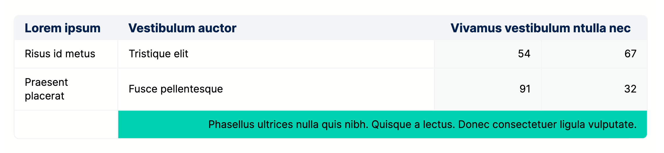
The below JSON (try copying it straight into the Cloud Editor):
{
    "type": "Table",
    "options": {
        "table_border": true,
        "vertical_margin": 6,
        "col_borders": true,
        "headings": [
            "Lorem ipsum",
            "Vestibulum auctor",
            {
                "content": "Vivamus vestibulum ntulla nec",
                "col_span": "2",
                "col_align": "center"
            }
        ],
        "col_bg": [null, null, "background-faded", "background-faded"],
        "col_align": ["left", "left", "right", "right"],
        "col_width": [null, 50],
        "rows": [
            ["Risus id metus", "Tristique elit", "54", "67"],
            [
                "Praesent placerat",
                { "content": "Fusce pellentesque", "valign": "top" },
                "91",
                "32"
            ],
            [
                "",
                {
                    "content": "Phasellus ultrices nulla quis nibh. Quisque a lectus. Donec consectetuer ligula vulputate.",
                    "col_span": 3,
                    "col_bg": "accent",
                    "col_align": "right"
                }
            ]
        ]
    }
}
will generate the following output:
Width
For details on the width key, please see here.
Example
Missing something?
Hybiscus is continuously improving and adding new features. If you think we are missing a critical feature, please do not hesitate to contact us and offer your feedback at support@hybiscus.dev