
Getting started
Premium components
Beta features
Deprecated components
Managed Cloud
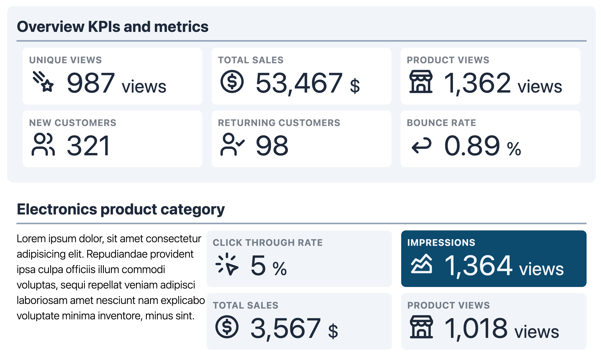
Section
The Section component is used to divide up the report into named regions. You
can provide a title, an optional icon, as well as the ability to highlight the
entire section.
Example JSON
Below are some examples of the JSON required to define a Section.
{
    "type": "Section",
    "options": {
        "section_title": "Section One",
        "icon": "dashboard",
        "highlighted": false,
        "columns": null
    },
    "components": [
        {
            "type": "Text",
            "options": {
                "text": "Lorem ipsum dolor sit amet"
            }
        }
    ]
},
{
    "type": "Section",
    "options": {
        "section_title": "Section One",
        "icon": "dashboard",
        "highlighted": true,
        "columns": 2
    },
    "components": [
        {
            "type": "Text",
            "options": {
                "text": "Lorem ipsum dolor sit amet",
                "colour": "light-background",
                "bg_colour": "highlight"
            }
        },
        {
            "type": "Text",
            "options": {
                "text": "Lorem ipsum dolor sit amet",
                "colour": "light-background",
                "bg_colour": "highlight"
            }
        }
    ]
}
Options
| Key | Description |
|---|---|
section_title | The title of the Section. |
font_size | Optional. Font size of the section title text. See here for more details. Defaults to xl. |
icon | Optional. The icon to place next to the value. |
highlighted | Optional. Defaults to false. If true, applies a subtle background colour to draw attention. |
columns | Optional. The number of columns to divide the section up into. See here for more details. |
width | Optional. The width of the component, when inside a Row component whose columns option is set to null. For more details, see please see here. |
horizontal_margin | Optional. Defaults to 3 if highlighted is true, otherwise defaults to 0. Margin added horizontally to the element. |
vertical_margin | Optional. Defaults to 1. Margin added vertically to the element. |
column_spacing | Optional. Defaults to 3. Spacing between components rendered as columns. Accepts any integer between 0 - 12, 14 or 16. |
row_spacing | Optional. Defaults to 0. Spacing between rows, when columns is not null and more components than columns are present. Accepts any integer between 0 - 12, 14 or 16. |
Font size
For details on the font_size key, please see here.
Components / extendable
This component is extendable, meaning it supports adding components
within it. To add components inside, simply add the objects defining
the components inside the components key
(defined as the level as type, not within the options key.).
Margin values
For the various options targetting margins, the allowed values are detailed here.
Icon
Icons are powered by the Tabler Icons
package which provides over 1,250 different icons. Simply use the icon name
provided on the Tabler Icons website in place of the icon key in your JSON.
Highlighted background
The background color is defined from the color theme variable background-default, which
in all themes is set to #fff or white. If highlighted is set to true,
this variable has a different value assigned to it, which is defined in the highlighted
section of the theme variables. For more details, please see here.
Example
Missing something?
Hybiscus is continuously improving and adding new features. If you think we are missing a critical feature, please do not hesitate to contact us and offer your feedback at support@hybiscus.dev