
Getting started
Premium components
Beta features
Deprecated components
Managed Cloud
Premium feature
This is a premium feature which requires a paid plan to be used. See here for more details.
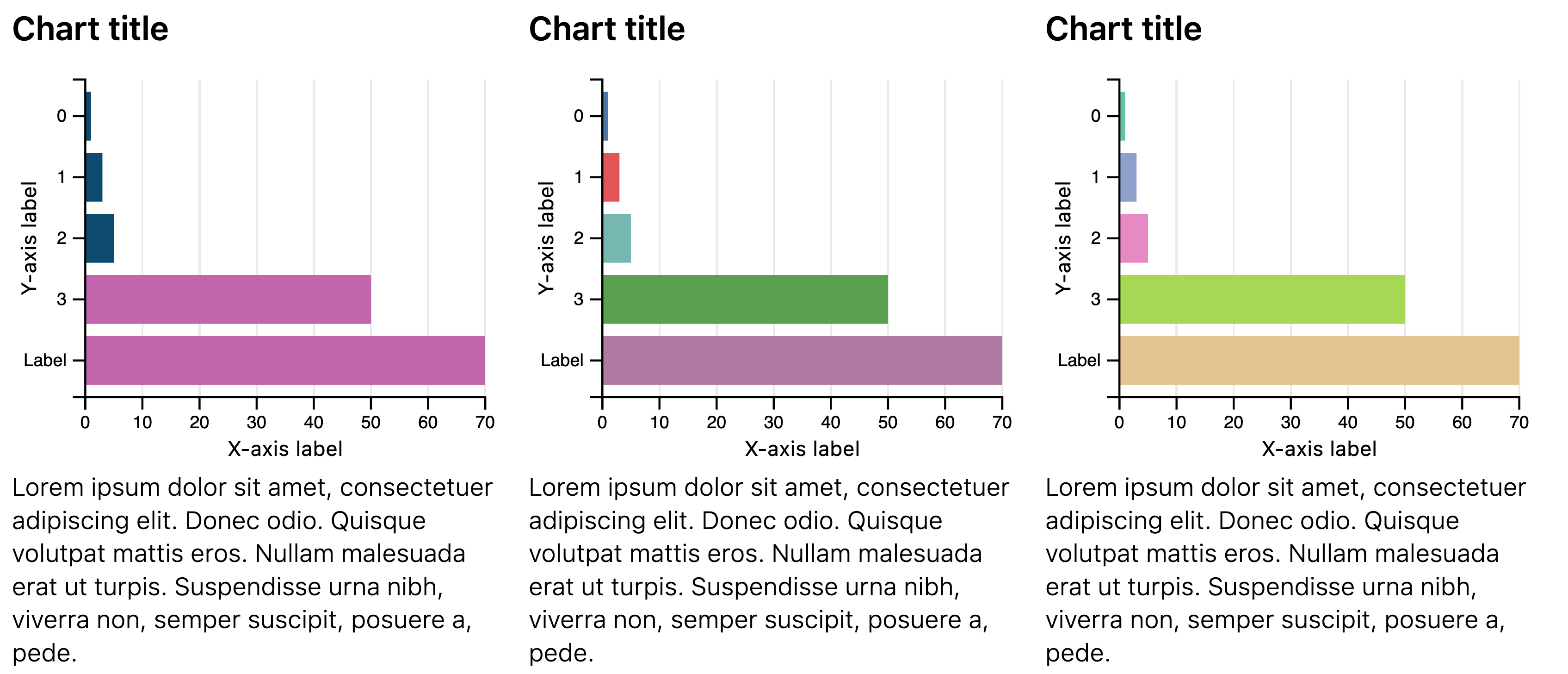
Horizontal bar chart
The Chart.HorizontalBar component is part of the premium set of chart components, with
greater control over their layout and design. The bar chart allows visualising
data on horizontal bars, with either a categorical or numerical Y-axis.
Example JSON
Below is an example of the JSON required to define a Chart.Bar component:
{
    "type": "Chart.HorizontalBar",
    "options": {
        "width": "2/4",
        "data": [
            { "y": 1, "x": 55 },
            { "y": 2, "x": 75 },
            { "y": "Label A", "x": 75 }
        ],
        "color_scheme": "Tableau10",
        "font_size": 12,
        "aspect_ratio": 1.2,
        "x_label": "X axis label",
        "y_label": "Y axis label",
        "chart_title": "Chart title",
        "caption": "Lorem ipsum dolor, sit amet consectetur adipisicing elit. Repudiandae provident ipsa culpa officiis illum commodi voluptas, sequi repellat veniam adipisci laboriosam amet nesciunt nam explicabo voluptate minima inventore, minus sint"
    }
}
Options
| Key | Description |
|---|---|
data | The data to plot in the chart. See below for more details. |
Data
The data key must be an array of objects, with each object containing the keys
x and y. To set the colour for each bar, provide a color key with a hex value. Values for y may be categorical or numerical. A maximum of 1,000 points can be plotted on a chart.
Theming
The colour of the bars can be set in one of three ways:
- Automatically chosen by the theme selected for the report. For more details see Theming.
- Overriding the color of each bar by passing a
colorkey for each object in thedatakey. - Setting the
color_schemekey to an option from color brewer scales. Allowed values include:- Category10
- Accent
- Dark2
- Paired
- Pastel1
- Pastel2
- Set1
- Set2
- Set3
- Tableau10
Width
For details on the width key, please see here.
Example
Missing something?
Hybiscus is continuously improving and adding new features. If you think we are missing a critical feature, please do not hesitate to contact us and offer your feedback at support@hybiscus.dev