
Getting started
Premium components
Beta features
Deprecated components
Managed Cloud
Line chart
The LineChart component is used for visualising data as a line chart. It
provides a simple way to include charts without the need for using external
libraries to generate an image.
This component is now deprecated in favour of the LineChart v2 component which provides more options and flexibility.
Example JSON
Below are two examples of the JSON required to define a LineChart.
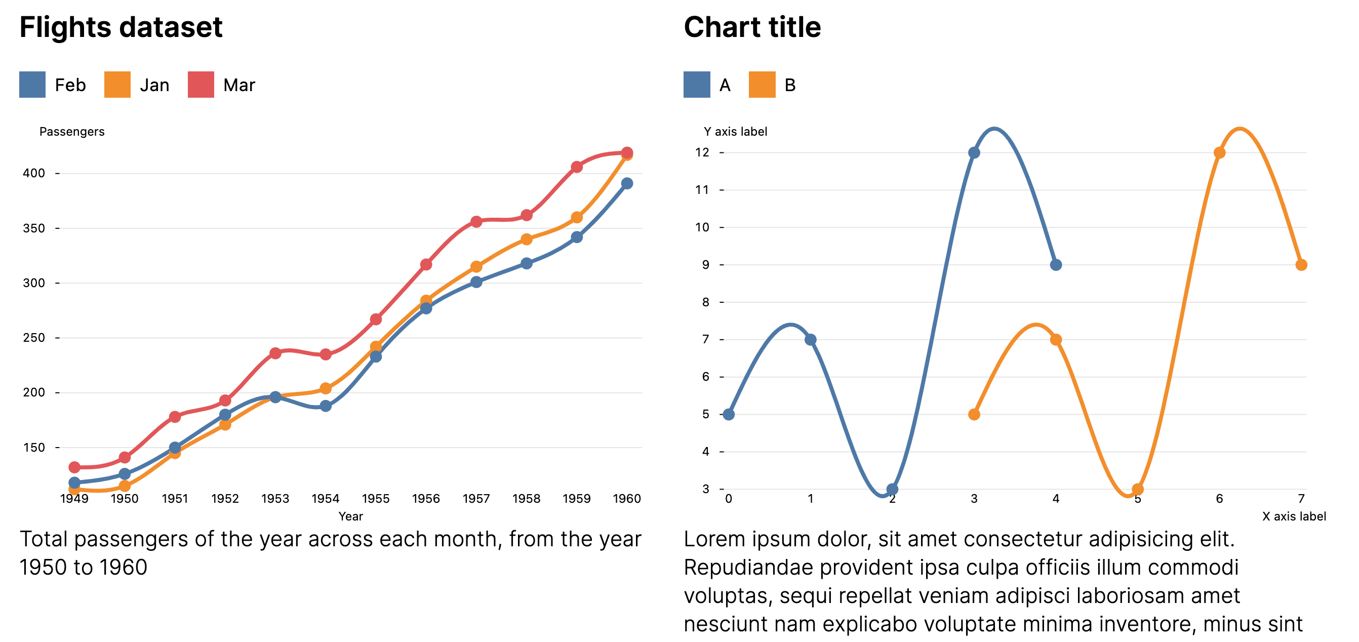
{
    "type": "LineChart",
    "options": {
        "width": "2/4",
        "data": [
            {"x": 0, "y": 5},
            {"x": 1, "y": 7},
            {"x": 2, "y": 3},
            {"x": 3, "y": 12},
            {"x": 4, "y": 9}
        ],
        "x_label": "X axis label",
        "y_label": "Y axis label",
        "chart_title": "Chart title",
        "caption": "Lorem ipsum dolor, sit amet consectetur adipisicing elit. Repudiandae provident ipsa culpa officiis illum commodi voluptas, sequi repellat veniam adipisci laboriosam amet nesciunt nam explicabo voluptate minima inventore, minus sint"
    }
},
{
    "type": "LineChart",
    "options": {
        "width": "2/4",
        "data": [
            {"x": 0, "label": "A", "y": 5},
            {"x": 1, "label": "A", "y": 7},
            {"x": 2, "label": "A", "y": 3},
            {"x": 3, "label": "A", "y": 12},
            {"x": 4, "label": "A", "y": 9},

            {"x": 3, "label": "B", "y": 5},
            {"x": 4, "label": "B", "y": 7},
            {"x": 5, "label": "B", "y": 3},
            {"x": 6, "label": "B", "y": 12},
            {"x": 7, "label": "B", "y": 9}
        ],
        "colour_by": "label",
        "x_label": "X axis label",
        "y_label": "Y axis label",
        "chart_title": "Chart title",
        "caption": "Lorem ipsum dolor, sit amet consectetur adipisicing elit. Repudiandae provident ipsa culpa officiis illum commodi voluptas, sequi repellat veniam adipisci laboriosam amet nesciunt nam explicabo voluptate minima inventore, minus sint"
    }
}
Description
| Key | Description |
|---|---|
data | The data to plot in the chart, which should be an array of objects with keys x and y. |
x_label | The X-axis label. |
y_label | The Y-axis label. |
colour_by | Optional. The key in the data objects to use to colour each line by. |
chart_title | Optional. The chart title. |
caption | Optional. Caption below the chart. |
width | Optional. The width of the component. Only applies when inside a Section or Row component whose columns option is set to null. |
Data
The data key must be an array of objects, with each object containing the keys
x and y. Both these keys should contain numbers (not strings). A maximum
of 500 points can be plotted on a chart.
Multiple lines
To draw multiple lines, you will need to add an additional key to the objects in data. The name of this key must be provided to the colour_by
option key, so Hybiscus can use it to group the data and colour the lines.
{
    "type": "LineChart",
    "options": {
        "data": [
            {"x": 0, "y": 5, "category": "Label A"},
            {"x": 1, "y": 9, "category": "Label A"},
            {"x": 2, "y": 4, "category": "Label A"},

            {"x": 0, "y": 6, "category": "Label B"},
            {"x": 1, "y": 12, "category": "Label B"},
            {"x": 2, "y": 7, "category": "Label B"}
        ],
        "colour_by": "category",
        "x_label": "X axis label",
        "y_label": "Y axis label"
    }
}
Width
For details on the width key, please see here.
Theming
The colour of the line / curve is automatically chosen by the theme selected
for the report. For more details see Theming. This only
applies if you have not used the colour_by option.
Plotting
By default, the lines are smoothed to make them more visually appealing. These charts should not be used for communicating data very precisely, but rather for showing general trends.
Example
Missing something?
Hybiscus is continuously improving and adding new features. If you think we are missing a critical feature, please do not hesitate to contact us and offer your feedback at support@hybiscus.dev