Creating PDF invoices with the Hybiscus API
Put together a professional looking PDF invoice using just the Hybiscus API.
One of the most popular use cases of Hybiscus by our customers, is to make PDF invoices. This is a great use of Hybiscus, as it allows any business to start generating PDF invoives on the fly, without requiring any complex dependencies and libraries to be installed for generating PDFs. All you need to do is make a simple HTTP request to the Hybiscus API, and your PDF will be ready in a matter of seconds. Furthermore, Hybiscus provides great security options such as cloud storage upload, making it an ideal solution for this task.
To make it even better for our customers, we've just added a bunch of new options to the Text, Table and Row components, that make it even easier for you to create invoices.
Creating an invoice
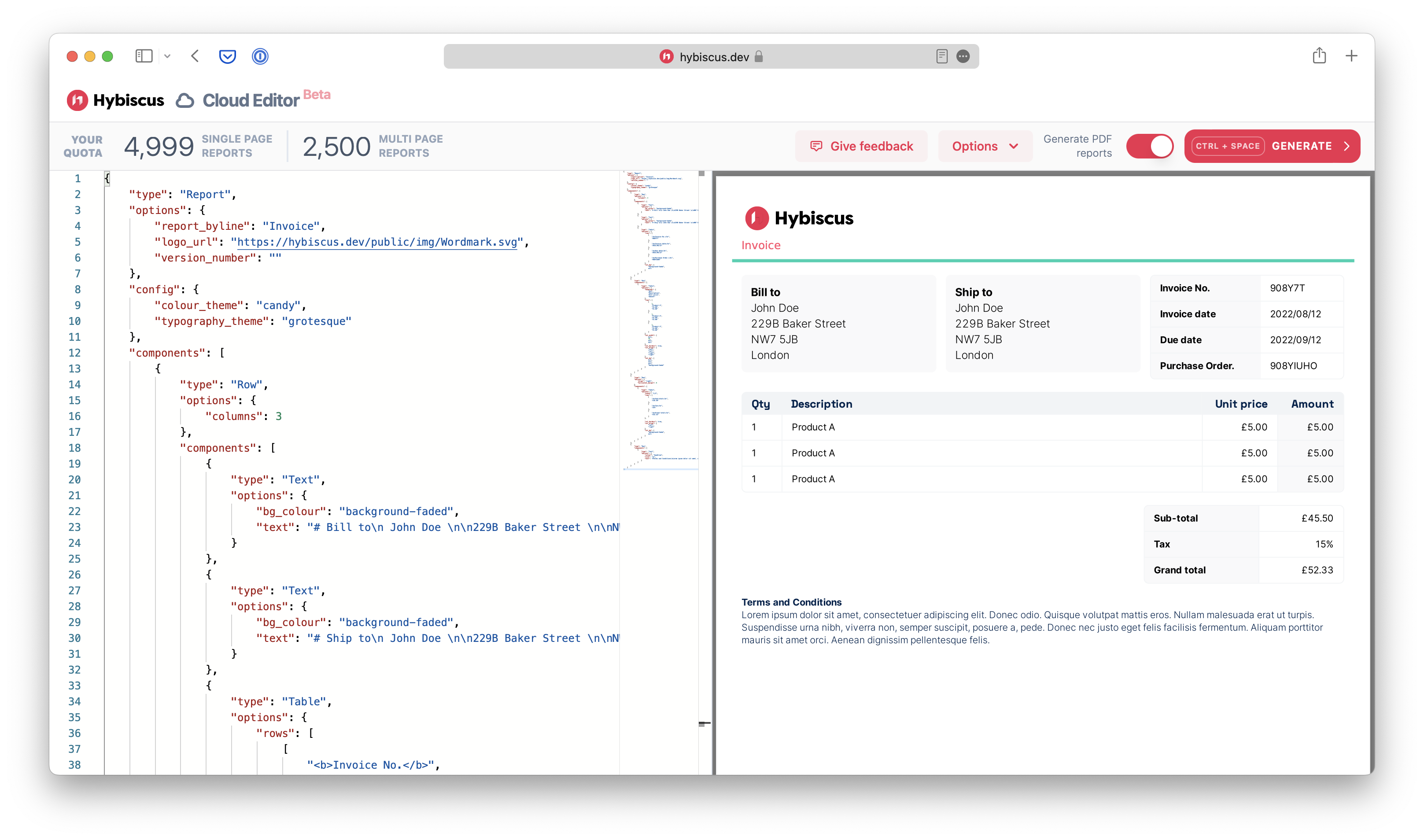
Let's make use of the latest additions to Hybiscus to create our invoice. Below, you'll find the complete JSON schema used to generate our PDF invoice. You can copy and paste the entire code to use as your own template, or read on below as we explain the various components & tips and tricks used throughout.
The easiest way to get started with Hybiscus is by using our Cloud Editor. This let's you prototype PDFs in your browser by focusing on the JSON schema, and seeing the preview right next to your code. When you're ready, you can take the JSON and integrate it directly into your codebase.
{
    "type": "Report",
    "options": {
        "report_byline": "Invoice",
        "logo_url": "https://hybiscus.dev/public/img/Wordmark.svg",
        "version_number": ""
    },
    "config": {
        "colour_theme": "candy",
        "typography_theme": "grotesque"
    },
    "components": [
        {
            "type": "Row",
            "options": {
                "columns": 3
            },
            "components": [
                {
                    "type": "Text",
                    "options": {
                        "bg_colour": "background-faded",
                        "text": "# Bill to\n John Doe \n\n229B Baker Street \n\nNW7 5JB \n\nLondon"
                    }
                },
                {
                    "type": "Text",
                    "options": {
                        "bg_colour": "background-faded",
                        "text": "# Ship to\n John Doe \n\n229B Baker Street \n\nNW7 5JB \n\nLondon"
                    }
                },
                {
                    "type": "Table",
                    "options": {
                        "rows": [
                            [
                                "<b>Invoice No.</b>",
                                "908Y7T"
                            ],
                            [
                                "<b>Invoice date</b>",
                                "2022/08/12"
                            ],
                            [
                                "<b>Due date</b>",
                                "2022/09/12"
                            ],
                            [
                                "<b>Purchase Order.</b>",
                                "908YIUHO"
                            ]
                        ],
                        "col_bg": [
                            "background-faded",
                            null
                        ]
                    }
                }
            ]
        },
        {
            "type": "Row",
            "components": [
                {
                    "type": "Table",
                    "options": {
                        "headings": [
                            "Qty",
                            "Description",
                            "Unit price",
                            "Amount"
                        ],
                        "rows": [
                            [
                                1,
                                "Product A",
                                "£5.00",
                                "£5.00"
                            ],
                            [
                                1,
                                "Product A",
                                "£5.00",
                                "£5.00"
                            ],
                            [
                                1,
                                "Product A",
                                "£5.00",
                                "£5.00"
                            ]
                        ],
                        "col_width": [
                            null,
                            70,
                            null,
                            null
                        ],
                        "col_borders": true,
                        "col_align": [
                            "left",
                            "left",
                            "right",
                            "right"
                        ],
                        "col_bg": [
                            null,
                            null,
                            null,
                            "background-faded"
                        ]
                    }
                }
            ]
        },
        {
            "type": "Row",
            "options": {
                "align": "right",
                "horizontal_margin": 0
            },
            "components": [
                {
                    "type": "Table",
                    "options": {
                        "width": "1/3",
                        "rows": [
                            [
                                "<b>Sub-total</b>",
                                "£45.50"
                            ],
                            [
                                "<b>Tax</b>",
                                "15%"
                            ],
                            [
                                "<b>Grand total</b>",
                                "£52.33"
                            ]
                        ],

                        "col_borders": true,
                        "col_align": [
                            "left",
                            "right"
                        ],
                        "col_bg": [
                            "background-faded",
                            null
                        ]
                    }
                }
            ]
        },
        {
            "type": "Row",
            "components": [
                {
                    "type": "Text",
                    "options": {
                        "colour": "headline",
                        "size": "xs",
                        "text": "#Terms and Conditions\nLorem ipsum dolor sit amet, consectetuer adipiscing elit. Donec odio. Quisque volutpat mattis eros. Nullam malesuada erat ut turpis. Suspendisse urna nibh, viverra non, semper suscipit, posuere a, pede. Donec nec justo eget felis facilisis fermentum. Aliquam porttitor mauris sit amet orci. Aenean dignissim pellentesque felis."
                    }
                }
            ]
        }
    ]
}

Instead of walking you through all the code, below we'll pick out the key components needed to make this PDF invoice, and explain the new additions to each of the components, that we've added.
New upgraded Text component
The Text component has been upgraded with some new customisation
options that we're making use of. You can now set a background colour (bg_colour) for the
text component, which when enabled automatically adds some inner padding (inner_padding) along
with a rounded corner to your component. This just highlights one of the
many ways Hybiscus makes it so easy to make a beautiful looking PDF report
with no design skills.
Some other great additions include the ability to control the colour of
the text using the colour key (which accepts one of the named colour
theme variables as options), and the ability to control the size of the text.
Also available from before, are powerful markdown formatting options, such as heading styles, bold & italicised text and newline breaks.
{
    "type": "Text",
    "options": {
        "bg_colour": "background-faded",
        "text": "# Bill to\n John Doe \n\n229B Baker Street \n\nNW7 5JB \n\nLondon"
    }
},
{
    "type": "Text",
    "options": {
        "colour": "headline",
        "size": "xs",
        "text": "#Terms and Conditions\nLorem ipsum dolor sit amet, consectetuer adipiscing elit. Donec odio. Quisque volutpat mattis eros. Nullam malesuada erat ut turpis. Suspendisse urna nibh, viverra non, semper suscipit, posuere a, pede. Donec nec justo eget felis facilisis fermentum. Aliquam porttitor mauris sit amet orci. Aenean dignissim pellentesque felis."
    }
}
Powerful layouts with the Row component
The Row component has been upgraded with a new option
to allow for more customisable layouts. The new align option allows you
to justify components inside the row, allowing for layouts such as a table
aligned to the right of the page. To enable this to work, you'll need to make
sure the columns key is set to null (i.e. no grid columns set up)
and your child component has a width that is not full (the default setting).
{
    "type": "Row",
    "options": {
        "align": "right",
        "columns": null
    },
    "components": [
        {
            "type": "Table",
            "options": {
                "width": "1/3",
                ...
            }
        }
    ]
}
Greater customisability with the Table component
Another component that has seen a big improvement is the Table component, with a large addition of new options.
Column widths
You can now provide a list of numbers (col_width) which control the percentage
widths of each of the columns, allowing you to selectively widen or narrow
certain, all or just a single column.
Text justification within columns
Similarly, you can now control the justification of text within columns using
the col_align option, which accepts left, right or centre justification. Once
again, you can choose to target a single, few or all columns.
Column background colour
The background colour of each column can be overriden with the col_bg option,
which, similar to the colour option in the Text component,
accepts a named colour theme variable.
Vertical borders
Finally, you can enable vertical borders using the col_borders option.
Colour theming
A common theme (pun not intended) in the upgrades to the Hybiscus components, is the option to selectively control the colours within the components using the named colour them variables. This is one of the most powerful features of Hybiscus, as it enforces simplicity yet retains powerful control to allow you to replicate your branding in Hybiscus.
The named colour theme variables mean you are restricted to a limited selection of colours to use, which are used consistently throughout your PDF. This helps reduce the mental overhead of managing lots of different colours, as well as avoiding the rookie designer mistake of using too many colours.
However, the colour override options available in the Report theming options mean you can selectively set the colours for each of these named variables, allowing you to simply reference the named variables throughout your PDF, whilst keeping your branding colours succinctly defined in a single location.
For more details on using custom colour themes with Hybiscus, check out our YouTube tutorial on this topic.
