Hybiscus API v1.17 released!
New features include data viz components, more color and typography themes, and improved Docs.
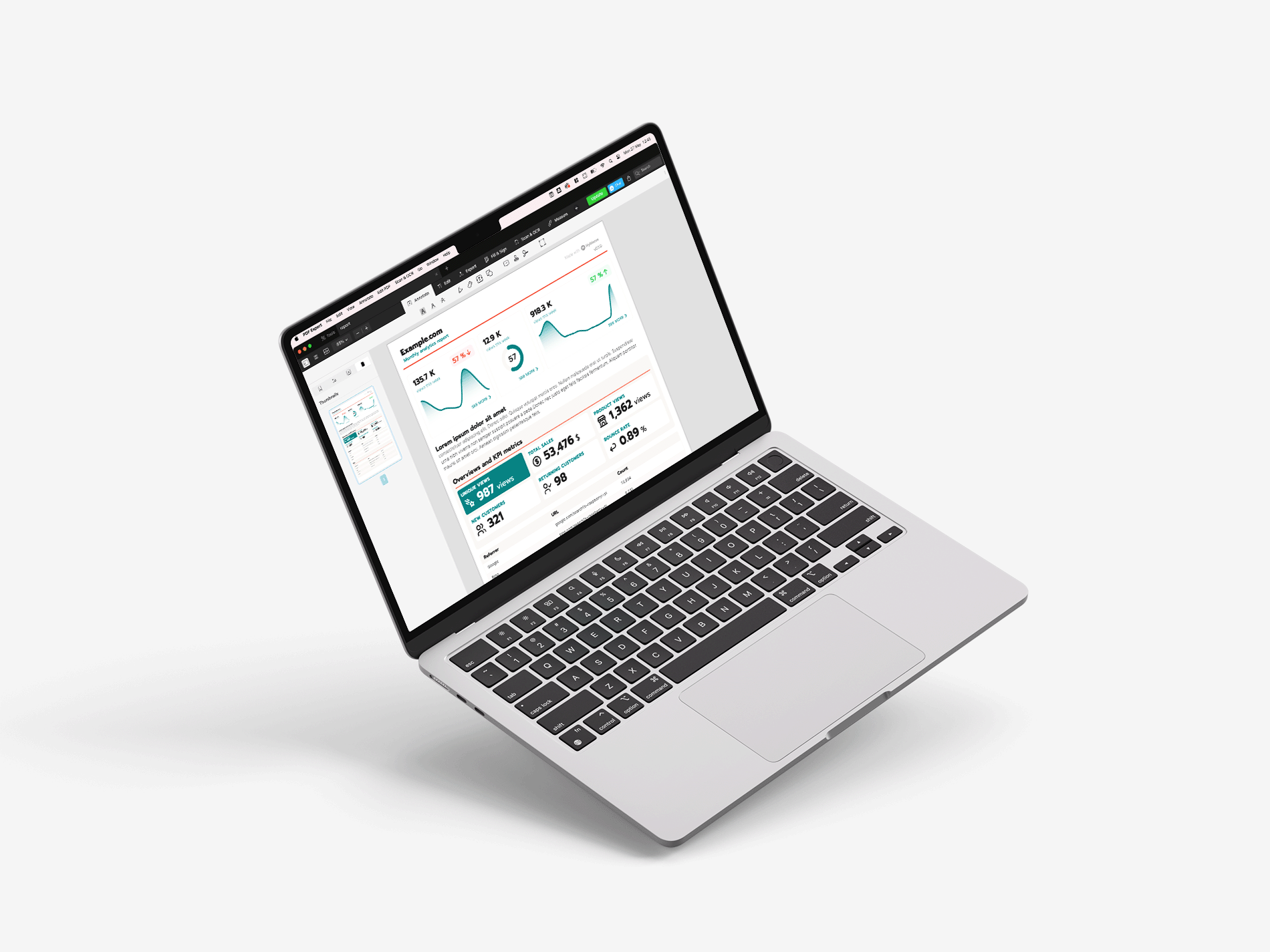
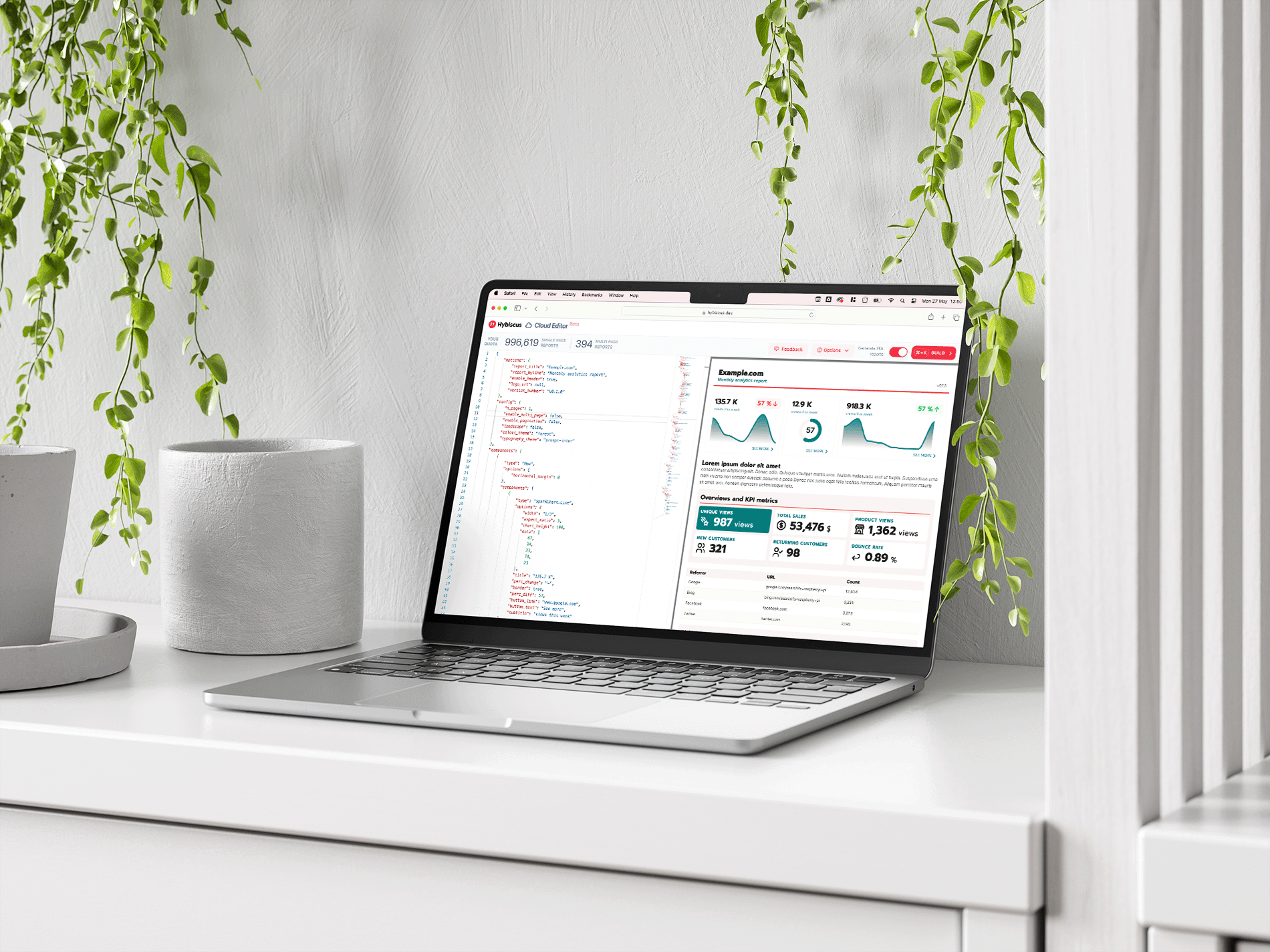
v1.17 of the Hybiscus API has just dropped with a bunch of great new features! We've added new data visualization components, a bigger selection of typography and color themes, as well as some more improvements to our Docs! Read on below to find out more.
New features
- New color themes added
- New color theme variable for paragraph text
- Expanded selection of typography themes
- Typography themes with separate fonts for headings and paragraph text
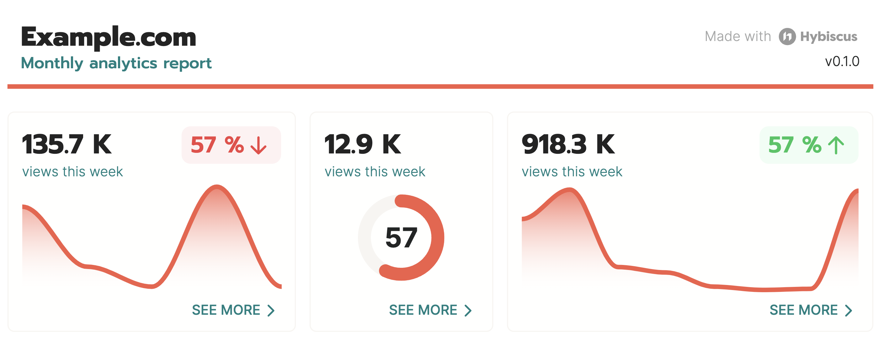
- SparkChart Line component
- SparkChart Ring component
- Copy to clipboard added to code blocks in Docs
SparkChart components
SparkCharts are a new family of data visualization components that allow you to display data in a compact and visually appealing way. We're adding two new such components, SparkChart Line and SparkChart Ring. Instead of focusing on the actual values in the graph, they simply visualise the trend of your data, allowing you to communicate patterns and changes easier.
Improvements to theming
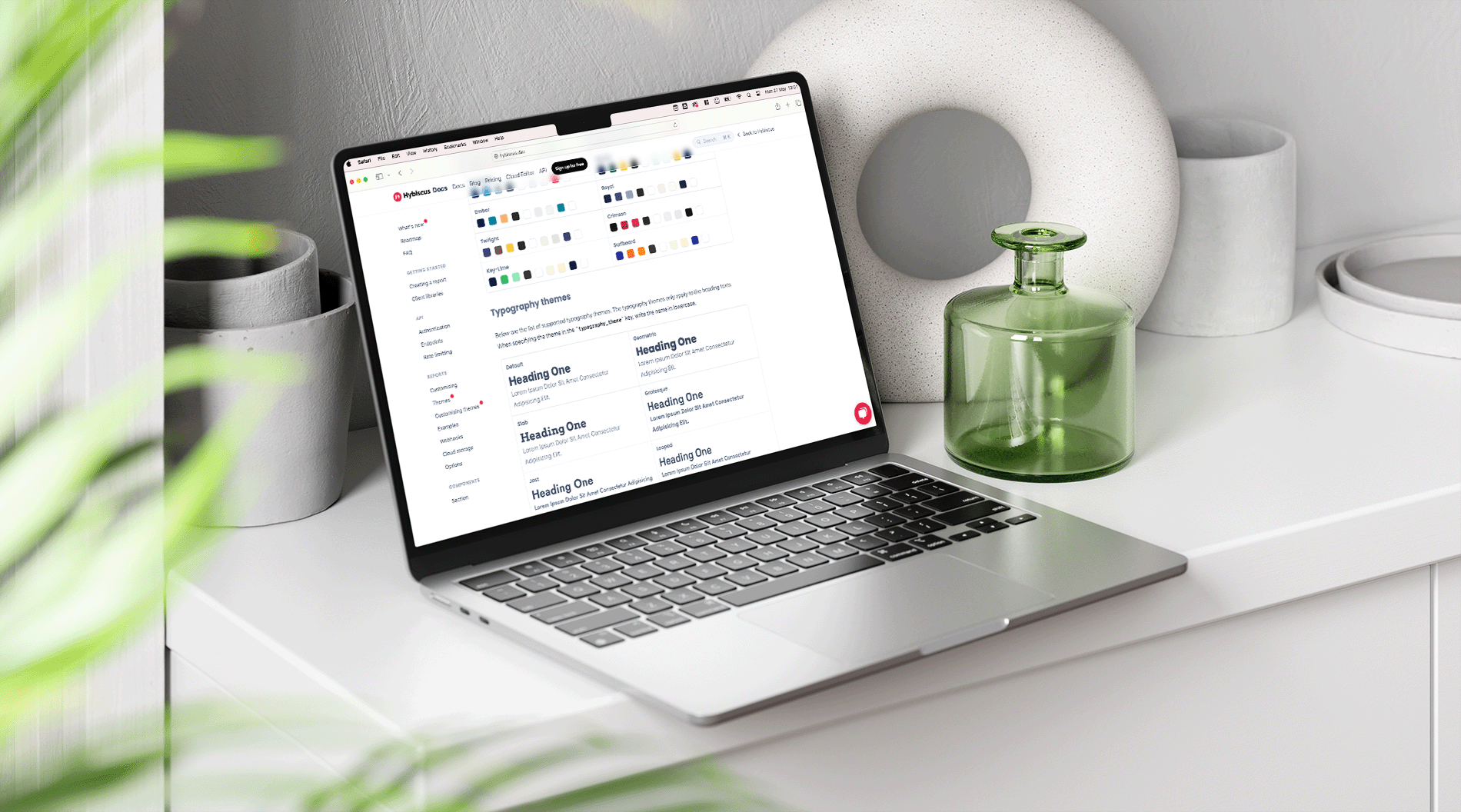
We've added more color themes to Hybiscus, giving you more options to customize the look and feel of your reports. Combined with the improved customization options we added in the last release for any color theme, you can now use these new themes as they are, or as a starting point to create your own unique theme.
We've also added a new color theme variable, paragraph, which allows you to customize the color of paragraph text.
Lastly, we've expanded the selection of typography themes, as well as adding themes with separate fonts for headings and paragraph text, to create more visually appealing reports.
Codeblocks improvements
We've improved the codeblocks across our Docs making it easier to read, especially when highlighting text inside one. We've also added a copy to clipboard button, making it even easier to try out any component inside the Cloud Editor.
We're always improving and shipping new features at Hybiscus, and customer feedback is at the center of our development process. If you have any feedback or suggestions, please reach out to us at support@hybiscus.dev.
