
Getting started
Premium components
Beta features
Deprecated components
Managed Cloud
Premium feature
This is a premium feature which requires a paid plan to be used. See here for more details.
Bar Chart (v2)
The Chart.Bar component is part of the premium set of chart components, with
greater control over their layout and design. The bar chart allows visualising
data on vertical bars, with either a categorical or numerical X-axis.
Example JSON
Below is an example of the JSON required to define a Chart.Bar component:
{
    "type": "Chart.Bar",
    "options": {
        "width": "5/12",
        "color_scheme": "Set2",
        "x_label": "Penguin species",
        "y_label": "Body mass (g)",
        "format_y_ticks": false,
        "data": [
            { "x": "Adelie", "y": 3300 },
            { "x": "Chinstrap", "y": 3800 },
            { "x": "Gentoo", "y": 5500 }
        ]
    }
}
Options
| Key | Description |
|---|---|
data | The data to plot in the chart. See below for more details. |
Data
The data key must be an array of objects, with each object containing the keys
x and y. To set the colour for each bar, provide a color key with a hex value.
Values for x may be categorical or numerical. A maximum of 1,000 points can be plotted on a chart.
If using the grouped_bars option, you must also supply an additional key,
label, which is used to label the different bars at a single X-position.
Theming
The colour of the bars can be set in one of three ways:
- Automatically chosen by the theme selected for the report. For more details see Theming.
- Overriding the color of each bar by passing a
colorkey for each object in thedatakey. - Setting the
color_schemekey to an option from color brewer scales. Allowed values include:- Category10
- Accent
- Dark2
- Paired
- Pastel1
- Pastel2
- Set1
- Set2
- Set3
- Tableau10
Width
For details on the width key, please see here.
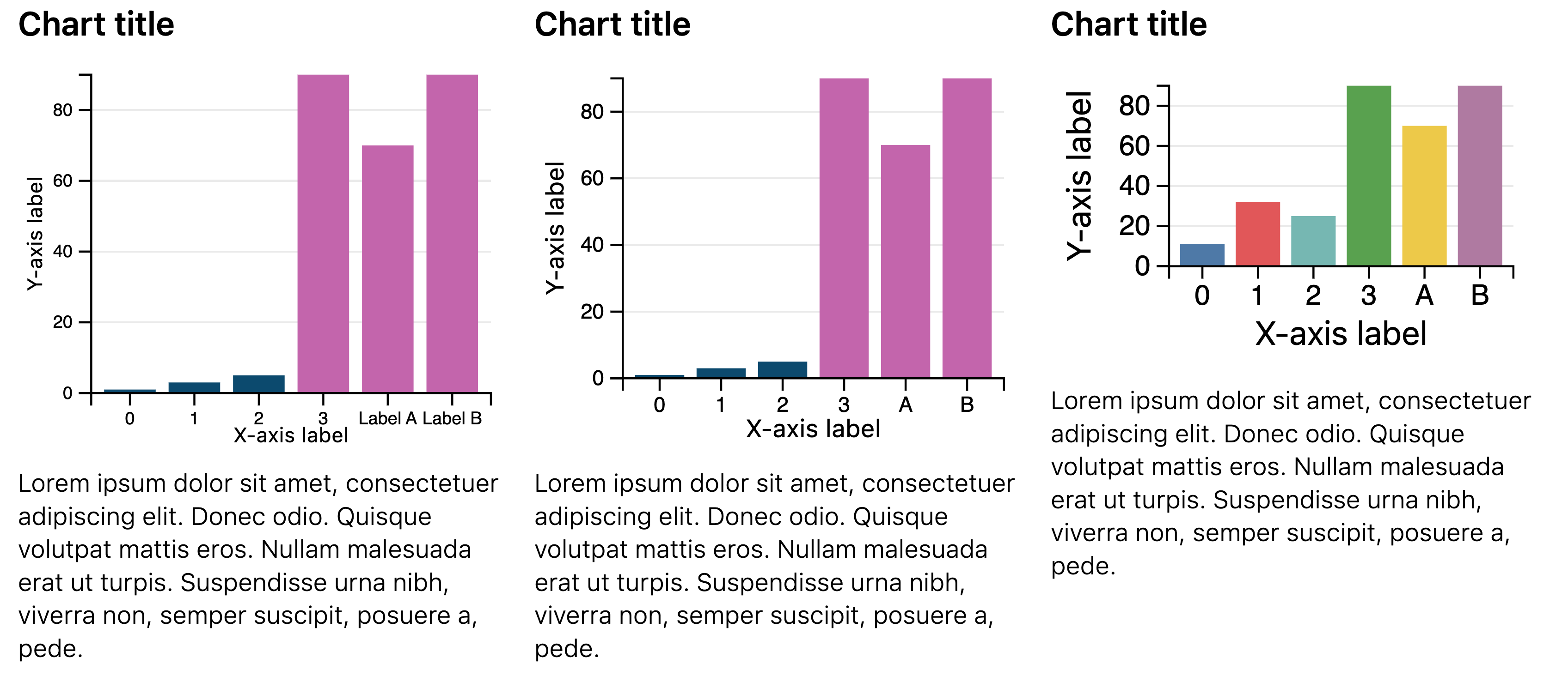
Examples
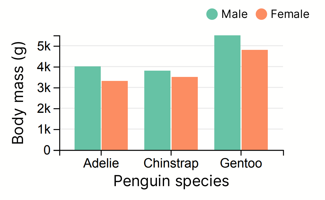
Grouped bars
If you set grouped_bars to true, Hybiscus can group your data at each
X-position. To do this, ensure each object in the data key's array has
a label key. This key is used to colour the bars at each X-position and produce
the legend above the chart. It is also recommended to use the
color_scheme key, rather than manually setting colors on each datum object.
Below is an example JSON (try copying it straight into the Cloud Editor):
{
    "type": "Chart.Bar",
    "options": {
        "width": "5/12",
        "color_scheme": "Set2",
        "grouped_bars": true,
        "x_label": "Penguin species",
        "y_label": "Body mass (g)",
        "data": [
            { "x": "Adelie", "label": "Male", "y": 4000 },
            { "x": "Adelie", "label": "Female", "y": 3300 },
            { "x": "Chinstrap", "label": "Male", "y": 3800 },
            { "x": "Chinstrap", "label": "Female", "y": 3500 },
            { "x": "Gentoo", "label": "Male", "y": 5500 },
            { "x": "Gentoo", "label": "Female", "y": 4800 }
        ]
    }
}
The generated component will look like below:
More examples
Missing something?
Hybiscus is continuously improving and adding new features. If you think we are missing a critical feature, please do not hesitate to contact us and offer your feedback at support@hybiscus.dev